Dynamic and strong, the logo of the Hurricanes was inspired by the power of the forces of nature.
Meaning and history
The Hurricanes are a professional rugby union team based in Wellington, New Zealand. It was founded in 1996.
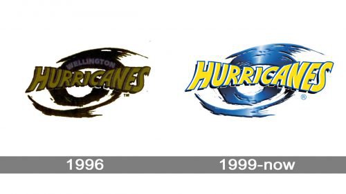
1996 — 1999
The storm on the emblem symbolizes the power of the players and their style. If this logo could talk, it would say: “We move around the field like hurricanes, and don’t you dare get under our feet.”
1999 — Today
The Hurricanes logo features a stylized depiction of a strong tropical cyclone. You can see an eye in its center and the ring of towering thunderstorms surrounding it. While the storm is powerful, it doesn’t look too scary. Perhaps, it’s partly because of the choice of colors, their happy and uplifting mood.
Font
The lettering looks dynamic – you can clearly feel the implied motion. The glyphs in the beginning and the end of the word are the highest, while those in the very center are the shortest. This approach not only conveys motion but also gives you a chance to see the eye of the storm clearly.
Colors
Vivid and eye-catching, the palette of the Hurricanes logo is comprised of yellow and blue. While the blue is pretty dark, it is still bright and saturated.


