Hulu is the name of the Disney online video-service, which was established in 2007. The service provides its customers with various series and movies, which are available by subscription. Today Hulu also offers live streaming and digital distribution and has almost 40 mil users worldwide.
Meaning and history
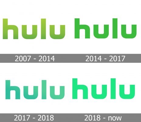
The visual identity of the service has almost remained in its original stated, undergoing three redesigns, it kept the shape and color palette of the initial logo, introduced in 2007, though elevated it to a new stylish and strong image.
2007 – 2014
The very first Hulu logo featured a stylized lowercase logotype in a custom geometric sans-serif typeface, which was executed in a calm gradient green and placed on a white background. The letters were light on top and became darker to their bottoms, looking slightly dramatic. This version of the logo stayed with the brand for the first seven years of its existence.
2014 – 2017
The redesign of 2014 kept the shapes and style of the Hulu inscription untouched but worked with its color palette. The new shade of green is used without any gradients, making the logo flat though bright and vivid. The grass-green shade reflects the growth and development of the service, representing its progress and energy.
2017 – 2018
After the acquisition of the Hulu part by Warner Media, the logo of the service was slightly changed again. The change was only about the color palette, which brought back delicate gradient shades and switched the main tone to turquoise-green, a color, standing for creativity and imagination, and bringing the relaxing chilling mood to the image.
2018 – Today
The redesign of the Hulu logo, which took place in 2018, introduced a new shade of green, which was used without any gradient shades. The lightened and brightened up color made the whole logotype look more elegant yet vivid and modern. The letters in the bright green shade look friendly, progressive, and funny, evoking a welcoming and inviting feeling.
Font and color
The custom Hulu logotype, written in lowercase letters, looks futuristic and stylish, and despite the thickness of its letters’ lines, it evokes a very fresh and light feeling. The Hulu font was designed specifically for the service, though is based on such commercial fonts as Good Timing Heavy, Nasalization Heavy, and Zekton Extended Black, with some lines and contours modified.
Green, which has been Hulu’s main color for years, is a commonly known symbol of success and growth, though it also represents dynamics and harmony, which the company puts into each of its products, trying to provide their users with the best video content available in the world.
The light and bright shade of green from the current Hulu logo version is also a representation of the service’s progressiveness and ability to change according to the need of its users and their interests.


