Hubba Bubba is an American chewing gum brand, which was established in 1979. Today the company is a part of Mars and produces its bubble-gum in various flavors. The products under the Hubba Bubba label are distributed all over the world.
Meaning and history
Hubba Bubba logo is one of the most colorful and playful examples of contemporary visual identity designs. Composed of a wordmark placed on the oval background, it plays with bright colors
What is Hubba Bubba?
Hubba Bubba is one of the world’s most famous brands of chewing gum, known for the variety of tastes and an unusual shape and size of the gums. The brand was established in the United States in the end of the 1970s, and today its products can be found all over the world.
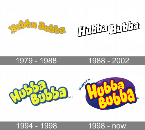
1979 – 1988
The original Hubba Bubba logo, designed for the brand in 1979, stayed with it for almost ten years, setting up the color palette to later versions. It was a heavy yellow lettering, written in a wave, and executed in a extra-bold rounded typeface, with the characters resembling bubbles. The wordmark was set in yellow, and has a light pink outline of each letter.
1988 – 2002
The redesign of 1988 has introduced a cleaner and more modern version of the Hubba Bubba badge, which was used by the brand until the beginning of the 2000s. The typeface got more geometric, with the straight sides of the massive title case characters, and the disposition of the inscription was switched to two parallel lines, placed diagonally, in the up-right direction.
1994 – 1998
Similar to the current Hubba Bubba logo, the old one featured the name of the brand in rather plump letters. The shape of the letters was inspired by the bubbles the chewing gum could produce.
The wordmark was rotated counterclockwise at around 20 degrees to add a slight upward dynamics.
1998 – Today
It was just an update, not a revolution. While the logo started to look a little more playful and friendly, you could still notice it had much in common with its predecessor.
The letters stayed plump and directed upward. On the other hand, the glyphs lost the serifs. Their ends grew rounded, which only added another link to the bubble shape. Also, there was some playing around with the size and shape of the glyphs – each of the four “b’s,” two “a’s,” and two “u’s” was slightly different from each other. This made the design more appealing in the eyes of the target audience, the children.
Also, a purple oval appeared behind the yellow lettering, which added a colorful touch.
We should mention an alternative version of the Hubba Bubba logo where the shape of the glyphs was closer to the circle. Here, the letters were of a cooler shade of yellow paired with the blue outline.
Font and Color
The custom hand-drawn logotype from the official Hubba Bubba badge features thick rounded lines, with all characters slightly “dancing” above the lines. The closest fonts to the one, used in this insignia, are, probably, Knicknack Variable, or Blowfish, but with significant modifications of the characters’ contours.
As for the color palette of the Hubba Bubba visual identity, it is based on an intense combination of yellow and red for the logotype, and the shade of the background varies depending on the flavor of the chewing gum inside the package. The yellow and red make a perfect pair to represent joy, fun, and energy.


