Orbit is a chewing gum label, produced by Wrigley since 1899. The brand is one of the most recognizable and popular sugarless gums in the world, which is being distributed all over the globe.
Meaning and history
The history of the product started in 1899, while its official launch in the US took place almost half a century later.
What is Orbit?
Orbit is the name of one of the world’s most famous and best-selling brands of chewing gum, which was established by Wrigley’s at the very end of the 19th century. Today the products of the brand can be found instores on all continents of our planet.
1923 – 1944
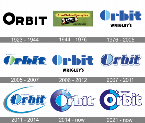
The very first Orbit badge, used by the brand in the middle of the 1920s, featuredheavy geometric lettering in the uppercase of a modern geometric sans-serif font, with the first letter enlarged. The stable distinctive letters of the inscription were set against the white background, with no additional elements. The badge looked very strict and professional.
1944 – 1976
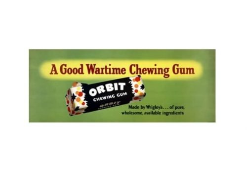
The first logo seen by the US consumers was a playful and friendly one. The white letters forming the name of the brand were white and pretty plump. They were slightly arched and irregular, which added a carefree feel.
The black background did not work for the same purpose at all. The vivid red, orange, and yellow fruits on both sides softened the gloomy effect, though.
1976 – 2005

This is when the brand adopted its cool icy style that has remained the same in its core ever since despite quite a few minor modifications.
This logo featured the name of the gum mostly in dark blue. The “O” was formed by two semi-circles, one dark blue, the other light blue. The small word “Wrigley’s” in black came below. The “r” and “b” were also made up of two pars with white gaps in between. Yet, these parts were not identical (as in the case of the “O”).
The company also used a version featuring a darker shade of blue and slightly different typography. The two-color “O” was the same, though.
2005 – 2007
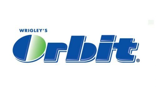
The type was italicized, which added some dynamism. The light blue half of the “O” was replaced by a green one introducing the “natural botanical” theme.
2006 – 2012
This one is the old 1976 logo with no changes at all.
2007 – 2011
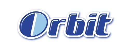
The slimmer type seems to emphasize the sugar-free essence of brand identity. This time, the typeface also looks a bit friendlier and modern due to the rounded shape. The white highlights and trim add some depth and icy sparks.
What is also important, the company gave up the “botanical green” theme and returned to the “icy light blue” original.
2011 – 2014
The name of the brand was supported by the visual depiction of an orbit. It was blue and added more dynamism. The shades grew slightly clearer although the overall color scheme was preserved.
2014 – Today
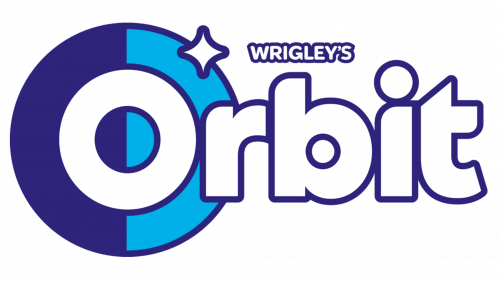
The Orbit logo went through a complete overhaul. The type was straightened and grew plumper without losing its dynamic streamlined touch.
The two-pieces “O” was now placed inside a larger ring, which, in its turn, also consisted of two halves featuring two shades of blue. The ring made the wordmark a little better legible as the glyph now was perceived as a single whole.
And yet, the main purpose of the redesign was a different one – the brand was trying to prepare consumers to the new name it was going to introduce the following year.
2015 (UK and Ireland), 2019 (Germany)
When Orbit was renamed Extra in several markets, the design forces behind the brand tried to make this transition as soft as possible. The dark and light blue ring became a visual link between the previous logo and the new version. The type remained pretty much the same, too, as did the palette. So, the consumers who were used to buying the same chewing gum might even have overlooked the change of the name as the package design was almost identical.
2021 – Today
The 2021 logo is based on the 2014 designs. This one, however, has no 3D effects (lighting, shading, etc.), looks flat and has a different font. They inflated and widened these letters, made them more uniform width-wise and turned ‘O’ in particular into a normal letter.
Font and Color
The heavy-styled lettering from the current official badge of the Orbit chewing gum is set in an extra-bold custom sans-serif font with the title case characters outlined. Even though the wordmark is executed in an exclusive designer type, it looks somewhat close to CFB1 Shielded Avenger STRIPE Normal, or Habanera outline, with the contours, significantly modified and some of the angles softened.
As for the color palette of the Orbit visual identity, it is based on white and two shades of blue, a combination, which immediately evokes a sense of freshness and cleanliness, which perfectly represents the essence of the brand and its refreshing menthol flavor.


