HTV7 is the name of one of the Vietnamese tv-channels, which was established in 1966 under the name THVN 9. Today the channel, headquartered in Ho Chin Min is available for broadcast not only inside the country but in all Asian regions through satellite.
Meaning and history

The name of the channel, HTV 7, is a derivative from Ho Chi Min TV, but before it was called Saigon Television, which was changed to Liberation TV in 1975. The visual identity of one of the most famous Vietnamese channels has always been pretty simple and neat, based on one composition, created in 1995.
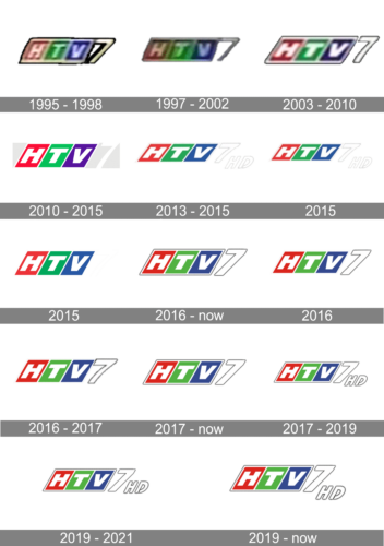
1995 – 1998
The logo, created for the channel in 1995 became the basement for all the following versions and was composed of three parallelograms in red, green, and purple with white “HTV” lettering on it. The composition was outlined in white and black and accompanied by a slightly enlarged “7” glued to its right. The digit was executed in light yellow or white and outlined in black.
1997 – 2002
In 1997 the three-dimensional badge of HTV7 was slightly refined. The contours were cleaned and the lines of the number “7” were made thinner and longer, which added some air and lightness to the whole badge. As for the color palette and shapes, — everything remained untouched.
2003 – 2010
The redesign of 2003 made the HTV logo clean and flat, removing all the voluminous elements and setting three colorful parallelograms on a small space between each other, outlining the whole image in black. As for the “7”, it was now totally white, also in a thin black outline.
2010 – 2015

The channel used this emblem briefly. It’s the same logo, but with a brighter color palette and without the outline for the number ‘7’ on the end.
2013 – 2015
The redesign of 2013 has slightly played with the color palette of the HTV7, with the purple shade of the third parallelogram changed to smooth blue. Another new thing in this version was the white outlined “7”, which was slightly enlarged and placed against a plain white background, followed by the uppercase italicized “HD” lettering in the same outlined style.
2016 – Today
With the redesign of 2016, the badge gained a delicate gray shadow, which made it look more vivid and dynamic. The straight lines gave confidence and professionalism to the emblem. In the same year, the HD option of the channel appeared, and for it, the lettering was added on the right from the “7”, in the same style and also shadowed.
January 1 – February 2, 2016

For this one, they actually just removed the white outlining for the part with blocks.
2016 – 2017

In this version, the number ‘7’ is slightly curved compared to the previous designs, which is the only prominent change.
2017 – Today

The 2017 logo is a lot like the one they keep using since 2016, except the outlines on this one are grayer.
2017 – 2019
In 2017 the HTV7 badge was redesigned again, bringing back the dark-gray fame for the tricolor composition, and adding the “HD” lettering after the “7” again. The letters were placed under the bottom line of the banner, being set in a smaller size than the digit. This version of the logo stayed in use by the channel for a couple of years.
2019 – 2021
The redesign of 2019 made the colorful part of the HTV7 badge larger, with the overall concept remaining untouched. The “HD” lettering and the “7” got a bit more air between them, and their outline became darker, creating a stronger contrast and adding a sense of professionalism and confidence.
2019 – Today
Another version, created in 2019, is still used by the channel. It features cleaner and bolder outlines and a larger size of the “7” and the “HD”. Overall, the composition remained the same, as well as the color palette, but the slight refinement of the contours made it look more progressive and strong.


