Hotels.com is the name of one of the world’s largest online travel companies, which operates across the globe and has its websites in more than 30 languages. Today the company, established in 1991 and headquartered in the United States, works with over 300 thousand hotels across the globe.
Meaning and history
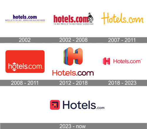
One of the world’s most famous online booking portals has a pretty intense visual identity history. Since the date of the company’s establishment, its logo has been redesigned about five times.
2002
The logo presented in a deep purple and white color scheme. The brand name “hotels.com” is in lowercase, featuring a relaxed and approachable sans-serif font. Above and below the main brand name are supporting texts, such as “Rates up to 70% off” and “Rooms for sold-out dates,” which emphasize value and convenience. Additional details include “NASDAQ: ROOM” and “A service of HRN since 1995 • World’s largest,” indicating the company’s stock market presence and longevity in the industry.
2002 – 2008
In the very beginning, the logo of the online service was composed of a simple wordmark in bold sans-serif, which was executed in different colors — from purple to red. Sometimes it was complemented by a long tagline, and in other variants, there was a delicate graphical image on the right. Usually, the image depicted a figure of a man with two suitcases.
2007 – 2011
The logo is a sunny, monochromatic wordmark of “Hotels.com” in a vibrant shade of yellow, invoking feelings of warmth and optimism. The text is smooth, with a playful flow. This design is cleaner and more modern compared to the previous logo, which featured a bellhop character alongside the text. The absence of this figure simplifies the design, focusing solely on the brand name and its online presence, signifying a more streamlined and digital-first approach.
2008 – 2011
In 2008 the logo was redesigned in a more modern and minimalist manner — the thin white nameplate was placed inside a red rectangle with rounded angles. There were two arrows, pointing up and down around the first letter “O”. The one pointing up was white, and the one pointing down — gray.
2012 – 2018
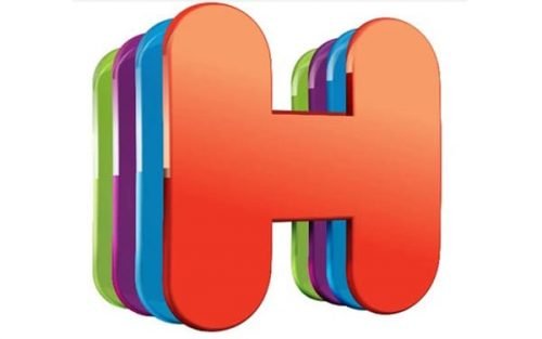
The logo we all know today was designed in 2012. It was a three-dimensional emblem, composed of a layered letter “H” in a bold rounded sans-serif. The letter featured a multicolor palette, representing traveling around the world and endless possibilities.
The wordmark in the title case was placed under the emblem and featured a playful rounded sans-serif typeface with the “Hotels” part in red and “.com” in chocolate-brown.
2018 – 2023
In 2018 the company decides to simplify the logo and the glossy three-dimensional emblem becomes flat and uses only two colors — fuchsia-pink and white. The logotype is now placed in one line with the emblem, on its right.
The inscription is executed in the same palette as the symbol and uses the same style of the typeface as the previous version.
2023 – Today
The red square with a stylized house façade is positioned to the left of the word “Hotels.com.” The rest of the text is in a bold, sans-serif font with “Hotels” appearing significantly larger than the “.com” portion, which is aligned to the bottom right of the main word. The color of the text is a deep blue, providing a professional and stark contrast to the red graphic element. This layout creates a balanced and eye-catching design that is easily recognizable.


