Epic is the name of an online reading platform for kids, which was established in 2013 in the United States. The online-service offers thousands of books and other materials for the little ones and successfully operates worldwide, providing children all over the globe with the most amusing and interesting content.
Meaning and history
Old
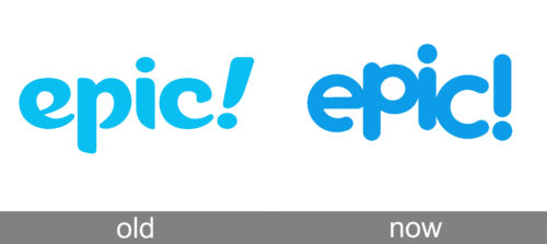
The original Epic logo was set in sky-blue, with the bold fancy lowercase inscription followed by a slightly slanted exclamation mark, and set against a plain white background. The custom typeface of the lettering featured curved lines with the ends pointed, but the peaks rounded. It was a very fresh and cool badge, which evokes a friendly feeling and a sense of trustworthiness.
Today
The visual identity of the educational web-service is simple yet cool and memorable. Its logo is designed according to the principles of simplicity, friendliness, and brightness, though it also looks professional and evokes a sense of trustworthiness due to the right choice of the color palette.
The blue and white palette of the Epic logo represents the company at its best, re-flecting its professionalism and expertise, and showing them as the ones who are reliable and responsible in providing their users with only the best materials.
The Epic logo is composed of a single blue wordmark, placed on a white background. The wordmark is written in the lowercase and uses a laconic rounded sans-serif typeface for its jumping letters. The thing that makes this minimalist logo rec-ognizable is a big exclamation mark, which uses the same color and style as the main lettering.
For the icon, the company uses the letter “El in the lowercase with an exclamation. It is executed in the same sans-serif and drawn in white. Placed slightly diagonally inside a blue square it looks fresh and cool, making you want to surf the website and stay there for something that is really interesting.
Epic Icon
The Epic icon is the letter “E” in the lowercase, executed in the same typeface as the wordmark on the official logo. The letter is followed by an exclamation sign. Both elements are drawn in white and placed on a blue square with rounded angles, slightly jumpy and diagonally.
The blue and white combination makes the minimalist icon bright and eye-catching, keeping the recognizability of the brand.


