Hot Wheels is a legendary brand of collectible cars, which has been popular among children and adults since the day of its appearance. The history of the Hot Wheels brand goes back several decades, and during this time thousands of models have been produced, each of which is a unique work. Copies of serial cars, which are produced by Mattel under the Hot Wheels brand since the middle of the last century, not only have not lost popularity but even acquired a certain collector’s value. Realistic toys for children are also loved by adults because they can easily trace the history of the world automobile industry, and with some luck even make a fortune.
Meaning and history
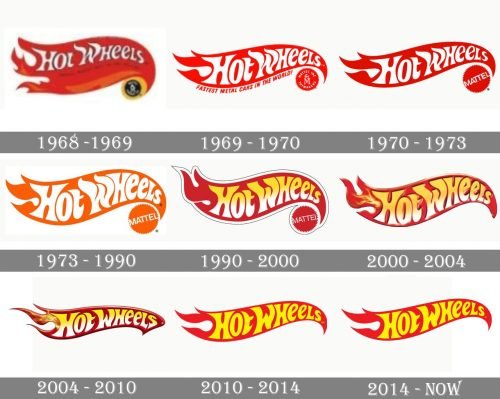
The US toymaker Mattel started the line of die-cast toy cars Hot Wheels in 1968. Since then, the Hot Wheels logo has gone through around ten updates. Nevertheless, it has been consistent in its overall style. That’s why the customers who weren’t very attentive and didn’t bother to compare the emblems side-by-side probably didn’t even notice the changes.
1968 – 1969
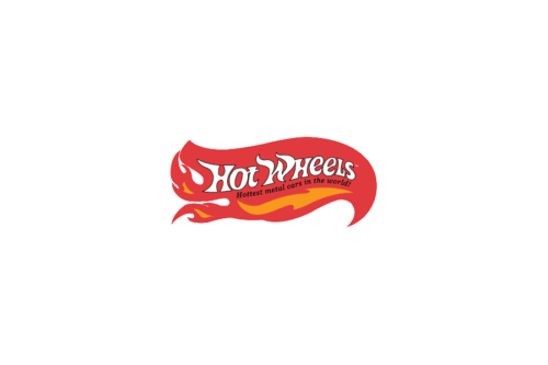
This is when the iconic flame logo was born. Elliot Handler, Mattel’s co-founder, decided to create a line of toy cars when he saw his son playing with Matchbox cars. He wanted the new cars to resemble the so-called hot rod. This means customized vehicles or even fantasy vehicles with all kinds of spectacular details, from huge rear tires to superchargers to flame paint-jobs.
The flame paintings on such cars were the main source of inspiration behind the logo. The “burning” emblem perfectly fitted the name of the brand, too. Moreover, the original logo showcased the tagline “Hottest metal cars in the world!” which also supported the same theme.
The flame on the original logo was larger and more realistic than in any of the following versions. In addition to the main red flame, there were smaller orange shapes inside, like in a real bonfire.
The shape of the white letters was also inspired by the fire. And yet, although they were highly stylized, they were still quite readable.
1969 – 1970
The Hot Wheels logo was simplified, while the name of the brand grew more prominent.
Now, the “fire” lost its orange elements. The number of decorative ends in the left part of the emblem was reduced to only three from the original seven. The white letters became larger, which emphasized the wordmark and made it better legible. While the glyphs preserved the original fiery style, they were redrawn.
The old tagline was replaced by “Fastest metal cars in the world!” Also, the tagline was moved out of the flame. The Mattel logo was added in the lower right corner, to create a link with the parent company.
1970 – 1973
The design became cleaner, easier to grasp, and easier to reproduce.
For one, the tagline was gone. Also, the Mattel emblem was simplified – it was now just the name of the brand inside a red circle with a zigzag border.
1973 – 1990
The words “Hot Wheels” grew yellow, while the red shape on the background grew darker. The shape of both the letters and the flame was slightly modified.
We can’t say that this was a change for the better as the white and red in the previous logo created a better contrast and made the name of the brand better legible. In the 1973 logo, not only the letters were darker but they were also bolder. Both worsened the legibility, in this case.
1990 – 2000
A black-and-white trim appeared around the logo. It added some dimension. The letters now featured a white and yellow gradient, which also contributed to the 3D effect. Both the red and the yellow were brighter than on the previous logo. The updated palette and shape of the glyphs resulted in a better-legible wordmark.
2000 – 2004
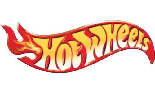
The 3D effect was preserved but now looked more professional. The obvious trim was replaced by a subtler one. Shades appeared around the glyphs. The gradient grew softer.
Also, the Mattel emblem was gone.
2004 – 2010
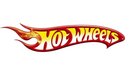
The updated Hot Wheels logo looked sleeker, more streamlined than its predecessor. Yet, the designers achieved this effect without dramatically changing the overall style.
2010 – 2014
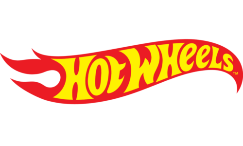
All the elements serving for the 3D effect were gone, so the design again became flat. Also, the shape of the right part of the emblem became different. It now looked more like on the logos released before the 2004 version (they all resemble a bird’s head).
However, a 3D version was still used as an additional one.
2014 – Today
The alterations were barely visible even if you compared the two versions side-by-side.
2018
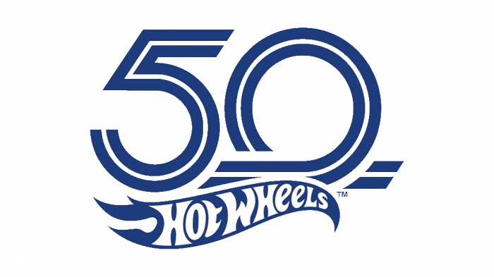
The brand unveiled a 50th-anniversary logo, where the main emblem was placed below the number 50 in large glyphs.
Color
Taking into consideration the word “hot” in the name of the brand and the flame inspiration, it’s only natural that the Hot Wheels logo has always been based on the “fiery” colors, including red, yellow, and orange.
Font
Instead of a ready-made font, the designers have always stuck to a custom wordmark. The shape of the letters, with their uneven, asymmetrical elements was inspired by the fire, like the logo itself.
Who made the Hot Wheels logo?
The bright and energetic Hot Wheels badge, which first version was introduced in the 1960s, was designed by Otto Kuhni, who worked for Mattel as a package designer. Since the very first year of the brand’s establishment, the badge, created by Kuhni has only been refined but never changed.
When did Hot Wheels change its logo?
Never. The hot Wheels logo has never been changed, although it was refined and modernized several times throughout the years. The latest refinement of the Hot Wheels badge was held in 2014, with the contours of the yellow inscription cleaned up, and the red shade of the flame-like banner strengthened and intensified.
What are the Hot Wheels saying?
Hot Wheels is all about energy and motion, so the brand could not do it without having a slogan. The motto of the toy manufacturer is “It’s Not The Same Without The Flame”, which replacing the original version, featuring the “Go with the Winner” phrase.
Who makes Hot Wheels?
Hot Wheels is a brand of toys, owned by an international company, one of the world’s leaders in the toy segment, Mattel. Even though Mattel and Hot Wheels are American brands, most of the toys are produced in the manufacturing facilities of the company, located in Asia — in China, Thailand, and Malaysia.


