Hershey is a famous brand of chocolate manufacturer, established in 1894 in the USA. Named after its founder, Milton S. Hershey, the company is loved and recognized all over the world and distributes its products across all six continents.
Meaning and history
Hershey’s logo is one of the most constant badges in the food industry. Being always based on the lettering, it’s today’s version almost completely repeats the badge, introduced at the beginning of the 20th century, keeping the shapes, concepts, and colors.
1890 – 1899
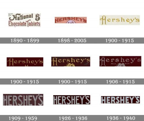
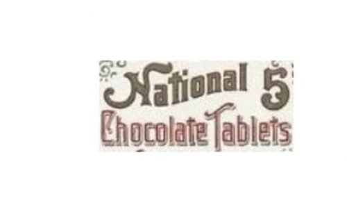
The brand we all know as Hershey’s today was established in 1890 under the name “National Chocolate Tablets”, so the original logo was fully based on the original naming and comprised a rectangular badge with an inscription set in two levels and two different styles.
The upper level had “National” in calm brown with elongated and curved lines of the “N”, while the bottom “Chocolate Tablets” lone was executed in a thin and delicate sans-serif typeface in red and white.
1898 – 1905
The brand was renamed after its founder, Milton Hershey, in 1898, and the logo was redesigned in the same year. The “Hershey’s” inscription was arched and executed in a bold serif typeface with all the letters capitalized and the first one — enlarged. The nameplate was written in dark red and featured a white and black outline, which added volume to the logotype.
1900 – 1915
A new concept of the logo was introduced in 1915. It was a gold ornate lettering in a custom serif typeface where the first capital “H” and the lowercase “R” had their tails elegantly curved.
1900 – 1915
Throughout the years the size of the letters and the color of the background have slightly been changed.
1900 – 1915
The letter lines became thinner and more sophisticated and the background turned dark chocolate from light cream.
1906 – 1915
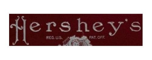
The redesign of 1906 switched the golden lettering to a silver one and changed the typeface of the inscription, making the lines of the letters thinner and more sophisticated. The contours of the letters became narrower, which made the whole badge look chicer and more elegant. There were also some additions made to the Hershey’s badge — the “Reg. US.” Was set on the left from the emblem, and the “PAT. OFF.” To its right.
1910 – 1959
The logo the whole world knows today was created in 1910 and featured a bold sans-serif inscription with all letters capitalized. The color palette was changed from gold and brown to silver and brown. The massive letters were bold and neat, looking vivid and fresh.
1926 – 1936
In 1926 the contours of the lettering have been refined and the lines became thinner and more delicate. The silver shade of the wordmark became lighter, so the contrast between the two colors of the palette got brighter and the whole logo gained a more modern look.
1936 – 1940
In 1936 the typeface was refined again. The letters of this time period were shorter and thicker than on the previous versions. The color palette remained untouched.
1940 – 1952
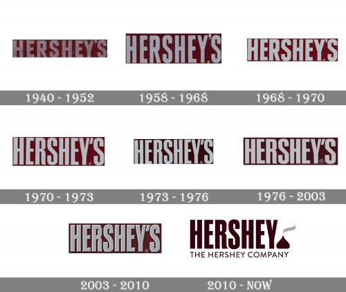
Another typeface was introduced in 1940. It was a stronger and more geometric sans-serif, where the solid letters were tall and stable.
1952 – 1968
In 1952 the glossy silver is being replaced by a light gray, and the lettering gains a new sans-serif typeface, which has taller and narrower contours.
1968 – 1970
The logo was modified and cleaned in 1968. It was the last version with the straight lines of the letter “R”. The color contrast of the emblem was made a bit stronger due to the use of a lighter shade of gray.
1970 – 1973
The elegant “R” with a smooth and slightly curved tail first appeared on the Hershey’s logo in 1970. All the other letters remained the same, their contours were only slightly modified. The color palette also repeated the one from the previous version.
1973 – 1976
In 1973 the background gained a darker and more elegant shade of brown, which added luxury and sophistication to the image, making the gray lettering more distinct and chic.
1976 – 2003
The color palette for a bit refined in 1976, as well as the shape of the letters. The inscription now looked more balanced and compact.
2003 – 2010
In 2003 the brand decides to create a three-dimensional logo and adds some gradient shades to its gray wordmark, which also gained a thin and delicate shadow. As for the background, it’s flat and solid brown color remains untouched.
2010 – Today
The minimalist 2D wordmark comes back to the brand’s visual identity in 2010 but in a new color. The lettering is now executed in brown and placed on a white background. In this scheme, the logo looks more modern and recognizable than ever. Another important detail was added in 2010 — the vertical inscription “Since 1894” in all caps was added to the left of the nameplate.
Font and color
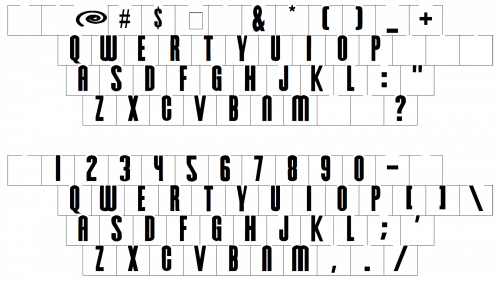
The bold condensed lettering with the tall sans-serif glyphs from the primary Hershey’s logo is set in a custom heavy font, which is pretty close to such typefaces as CG Triumvirate Extra Compressed and Swiss 911 Std Extra Compressed, with just minor modifications.
As for the color palette of Hershey’s visual identity, it is based on a warm and intense chocolate-brown shade, which looks expensive and elegant and brilliantly represents the main product of the company, it is chocolate.


