

![]() Applebees Logo PNG
Applebees Logo PNG
The first Applebees logo, which appeared in 1980, featured the company’s original name, T.J. Applebee’s Rx for Edibles and Elixirs. By 1986, it was replaced by a more appealing design sporting the red apple that has been the logotype’s visual center ever since.
Meaning and history
![]()
In 2007, the logotype was extensively overhauled. A new typeface was introduced, while the apple was modified and moved to the right. The new color scheme looked by far brighter than the previous one, especially the red outline, which created an eye-catching contrast with the leaf.
This version of the logo looked very close to that of the Apple company. One could notice similarities not only in the shapes and the position of the leaf and the apple, but even in the typeface. However, the two companies seem to have had no legal issues on the topic.
What is Applebee’s?
Applebee’s is the name of an American chain n of casual finding restaurants, which was established in Georgia at the beginning of the 1980s, and by today has grown into one of the market leaders, with almost 1,8 thousand restaurants not only in the United States, but also in Canada, Mexico, Brazil, and a few more countries in Latin America and the Middle East.
1980 – 1982
![]()
The very first logo for a famous restaurant chain was introduced in 1980, featured a stylized green lettering pen closed in a red and white geometric frame, with the white “For Edibles & Elixirs” tagline in all capitals of a traditional sans-serif typeface tagline cup placed on a thick bottom part of the framing.
1982 – 1983
![]()
Applebee’s logo, designed in 1982, has stayed with the company for just one year. It was a red and black two-leveled lettering, set against a white background, with a small solid red apple placed on the upper right corner of the composition. The inscription was set in a fancy gothic-style typeface, which made the badge of the chain stand out in the list of its competitors.
1983 – 1985
![]()
The redesign of 1983 brought the graphical symbol, which became iconic throughout the years — a red apple placed slightly diagonally over a dark green banner with a white stylized inscription on it. The banner featured a horizontally stretched rectangular shape with rounded angles, and a thick black and white outline.
1984 – 1985
![]()
In 1984 the badge of the casual dining restaurants chain was redesigned again, introducing another version for another year. It was fully based on the previous version of the logo, with just a few barely visible modifications of the characters’ contours. The white letters became a bit bolder and more elegant, creating a stronger look at the whole badge.
1985
![]()
For just a few months in 1985 the company had been using a badge, with the “TJ” part of the inscription set in small capitals in the upper left corner of the badge, above the two “P”s in the main part of the wordmark. Because of the new placement, the green banner got taller, but all other elements remained pretty much the same.
1985 – 2007
![]()
The redesign of 1985 has returned to the original shape of the badge, with the “TJ” lettering completely removed from the composition. The color palette was intensified, and now the horizontally-oriented banner gained a thick black outline, which added confidence and professionalism.
2007 – 2014
![]()
All elements of the logo were redrawn in 2007. The typeface was switched to more modern ones as well as the contours of the apples which were now placed on a white background directly above the double “P” of the inscriptions the color palette was brightened up, making the whole composition more vivid and friendly.
2014 – 2017
![]()
The redesign of 2014 turned the light green lettering into a black one and refined the typeface to a classy and sleek serif, with some lines elongated and slightly curved. The new red and black combination of colors in the Applebees logo looked very elegant and timeless, especially when placed on a white background.
2017 – present
![]()
In 2017 only a strict and laconic “Grill & Bar” tagline was added to the bottom part of the emblem. Written in the uppercase letters of a string and slightly narrowed sans-serif typeface, the tagline added professionalism and stability to a stylish iconic badge.
“Speaking” symbol

Instead of a spokesperson, Applebee’s used to have a spokesapple. The chain’s mascot, nicknamed the Applebee’s Apple, appeared in its numerous commercials explaining the benefits of the restaurants and repeating the slogans. The person who voiced the Apple in 2007 was the American actress and writer Wanda Sykes. In 2012, the advertising campaign was narrated by Jason Sudeikis.
Font
![]()
The font looks playful and appealing. It features a distinctive “A” with an elongated right end.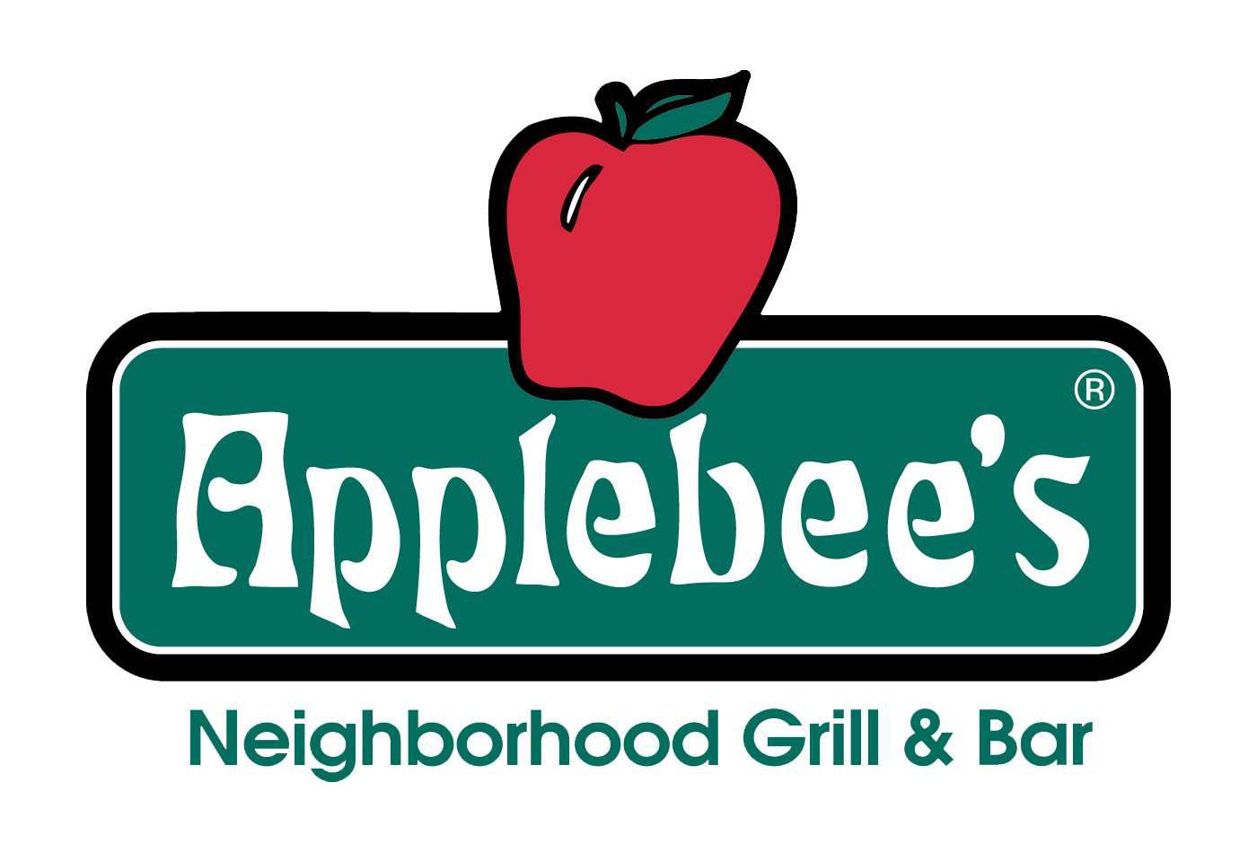
Color
![]()
How is the current color combination different from the previous one? Gone is the bright, almost neon red outline, because of which the apple looked so vivid and joyous. The leaf went red, like the apple, so the number of colors in the palette was reduced. Also, the text “Applebee’s” was recolored from green to dark grey, almost black.


