

![]() Herbalife Logo PNG
Herbalife Logo PNG
A light green plant seems a perfect logo for a company promising natural herbal products and “healthy, active lives” for its customers.
Meaning and history
![]()
One of the world’s largest multi-level marketing corporations, Herbalife Nutrition was established by Mark Hughes in 1980. While the company is headquartered in Los Angeles, California, it is incorporated in the Cayman Islands. The product range includes a variety of dietary supplements, weight management and sports nutrition products.
1980 – 2016

At first glance, the previous version of the logo looks very much like the current one. If you take a closer look at the text, though, you’ll notice a couple of notable differences. To begin with, the letters are taller and thinner on the old logo. Also, there seems to be more breathing space between them than on the current emblem.
The glyphs themselves aren’t the same, too. For instance, the “E’s” on the old wordmark had the horizontal bars of different lengths. The top bar was the shortest, while the lowest bar was the longest. In a way, their lengths reflected the proportions of the leaves (or petals) of the plant in the picture.
You can also notice that the right end of the “R” is simpler than it is on the current emblem. The two diagonal bars forming the “A” differ by width.
2016 – Today
![]()
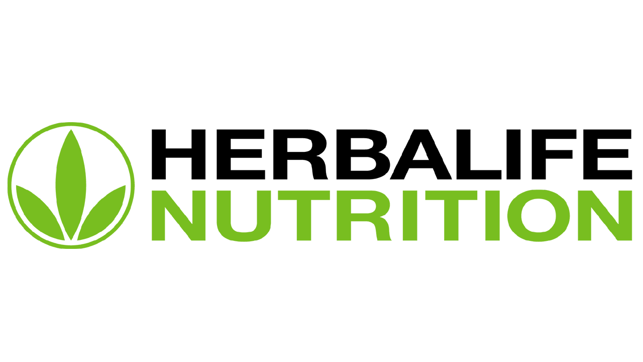
In 2016, the previous emblem was stripped of its thick black frame and given a new, slimmer green one. Moreover, the green coloring across the logo was brightened almost to the shade of lime. As for the text, it was all on the right now. There were two lines written in capital sans-serif letters: ‘HERBALIFE’ in black, ‘NUTRITION’ in green.
Symbol
The logo can be broken into two parts: the emblem depicting a plant on the left and the wordmark on the right.
The emblem represents a plant (herb) with three leaves (or petals). The two leaves on the sides are smaller than the leaf in the middle. The design is symmetrical: its left part looks like the mirror reflection of its right part. The three leaves are green over the white background. They are placed inside a thin green ring.
The wordmark features the text “Herbalife Nutrition” in two lines. While the letters seem to have a similar style, their colors are different (black for “Herbalife,” green for “Nutrition”).
Font
In the official brand guidelines, the company names Helvetica Neue the core brand font. The old Herbalife logo, though, featured a different type.
The current logo appears to be based on Neue Helvetica Pro 65 Medium (or a similar version of this type). The font wasn’t taken as it was but slightly flattened. The customization was necessary to make sure the double-lined wordmark was the same height as the pictorial part of the emblem.
Colors
![]()
According to the version of the brand guidelines issued in 2016, the shade of green featured on the logo is the PANTONE 368 C.


