In the world of sporting goods and equipment, there is a brand that has always stood out for its quality and innovation – Head. From its beginnings in a small workshop to its prominent position in the global market today, this is a brief history of a brand that has left an indelible mark on the sports industry.
Meaning and history
Head’s history began in the United States more than half a century ago. Howard Head founded the Head Ski Company in 1950 in Baltimore, Maryland. The founder of one of the world’s most famous sports brands was driven by a bad skiing experience.
An interest in the unknown and untried led Howard to an introduction to alpine skiing in 1947 while vacationing with friends at Stowe Mountain Resort, Vermont. This event was a turning point in his life.
Head stated that by using metal plates and aircraft construction techniques, he could make better skis – lighter and more efficient. So he gave up trying to master traditional skis, bought a $250 band saw, and began designing his skis in his spare time.
In 1947, Head began developing the honeycomb ski design, a honeycomb core placed between two metal plates. Howard firmly believed that his future lay in the development of a new ski concept. So he resigned in January 1948 to devote all his time to the development of his project.
During a poker game, Howard won $6,000 and used it to found the Head Ski Company in Timonium, Maryland, USA.
By the spring of 1950, Head had developed the final design for the alpine skis. During the winter of 1951-1952, Head and his two dedicated employees were able to create 300 pairs but were left in the negative. The following season they increased production to 1,100 pairs and were able to make ends meet. That was the first step toward success.
And a year later, Howard Head finally made its first profit, and by 1955, Head was already the leading brand in ski sales in the United States and Europe.
Howard Head also became thoroughly interested in the sport of tennis and began developing tennis rackets. As with skis, tennis rackets were made of wood, and their design has not changed much in 100 years. In 1968, Head launched a division dedicated solely to the development of tennis equipment. A year later, the first metal tennis racket was presented at the U.S. Open.
While skiing and tennis remained at the center of Head’s business, the brand wasn’t about to stop. Over the following decades, Head expanded into other sports, including snowboarding, racquetball, squash, and swimming.
This diversification allowed Head to cater to a wider audience of athletes, strengthening its presence in the world of sports. The brand’s dedication to innovation has remained unwavering, and every product introduced has met the highest standards of quality and performance.
Howard Head revolutionized two sports. He did so with his gift of foresight and intuitive approach. But he was not driven by a desire to change the industry, but to improve his abilities.
Today, Head’s core products are market leaders thanks to their sales and reputation, as well as having achieved great brand recognition. Head’s ski headquarters are located in Austria, from where it operates worldwide. The main production facilities are located in Austria, Italy, and the Czech Republic.
With a diverse product range and presence in a multitude of sports, the brand continues to push the boundaries of innovation. From tennis stars like Novak Djokovic to skiing stars like Lindsey Vonn, Head products are trusted by the world’s best athletes.
What is Head?
Head is the name of the world’s leading manufacturer of sports equipment, clothing, and accessories. There are 6 brand directions in total: Head Ski, Head Snowboard, Head Tennis, Head Protect, and Head Sportswear.
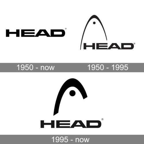
In terms of visual identity, Head shows its value of heritage and roots. The logo of the brand has barely been changed throughout the long history of the brand, and it shows the Head’s consistency and focus on quality.
1950 – Today
Since the beginning of the brand’s foundation, an integral part of its visual identity has been the uppercase logotype, written in heavy extended sans-serif characters with square cuts of the lines. This wordmark is a representation of the stability and high quality of the brand’s products.
1950 – 1995
If the logotype remains untouched, the graphical part of the Head logo has undergone small modifications. The original version of the emblem depicted a schematic image of a Ski Tip — a black medium-weight arched line with a small black roundel placed under its peak. This emblem stayed untouched for more than half a century.
1995 – Today
After the redesigns in 1995, the arched line from the Head emblem became thicker and shorter, with sharp geometric cuts of the ends, and the roundel got larger. The concept remained the same, but due to bolder lines, the whole logo started looking more progressive and confident. Also, the thickness difference between the bars of the graphical and text parts got more balanced.
Font and color
The iconic uppercase lettering from the primary Head logo is set in a brutal geometric sans-serif typeface with extra-wide contours of the characters and straight cuts of the bars. The closest commercial font to the one, used in this insignia, is, probably, Square 721 Bold Extended, with its massive characters and strong stability.
As for the color palette of the Head visual identity, it is based on the classic combination of black and white, but sometimes the logo is accompanied by orange elements.


