Hansa is the name of a German automaking company, which was established in 1905 and merged with Lloyd in 1914. The company was acquired by Borgward in the early 1930th, and the production of Hansa Borgward cars lasted until 1933.
Meaning and history

During its not very long history, Hansa managed to have four different logos, which all looked modern and elegant, some of them were even too progressive for those times.
There were two emblems drawn in the shape of the shield — one was a vertically elongated red and silver badge with delicate lettering on the top silver part, and the second was composed of a checkered gold and black shield with a golden capital “H” in the middle.
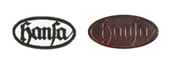
But the most famous Hansa logo featured a horizontally placed oval with the wordmark in the center. The monochrome logo looked elegant and simple, yet became very recognizable due to the unique font of the lettering.
The Hansa nameplate was written in the lowercase in an ornate gothic-style typeface with sharp angles and elongated lines. The playful tail of the letter “A” was touching the thick black oval frame.
There was one more version of the logo, designed for Hansa — a gold and black triangle with laurel leaves and the bold “H” with its vertical bars stretched to the sides. But it was not much used by the company.


