In this article, we will trace the evolution of the logo of the American company Hallmark Cards, Inc. The logo of the Hallmark Channel is based on the same wordmark with the addition of the word “Channel.”
Meaning and history
The company, which today is the largest manufacturer of greeting cards in the world, as well asits television channel, and a dozen famous brands in various fields, was founded by Joyce Clyde Hall, a young boy who began selling greeting cards at the age of 16.
In 1911. Joyce Hall, along with his brother Rolly, established a company that first sold postcards and a few years later began to produce them itself.In 1925 the company was renamed from Hall Brothers to Hallmark, and the brand began to place its logo on the back of each postcard.
The company has never stopped developing and evolving, and already at the beginning of the 1950s The Hallmark Hall of Fame series began airing on television, and by the 1990s it had grown into a cable channel that specialized in family programs and movies.
In 1994, the company acquired the Forever Friends brand, and with it the famous bear, which began to appear not only on postcards but also as a soft toy.
Now the brand has its museum, which has the rarest copies of greeting cards of the last century. There you can see Hallmark postcards with images created by famous people, such as the artist Salvador Dali or the British Prime Minister Winston Churchill.
What is Hallmark?
Hallmark is the name of a globally famous company, which is not only the world’s largest manufacturer of greeting cards butalso owns cable television, a brand of Crayola felt-tip pens and paints, and a whole group of subdivisions that specialize in the production of gifts, souvenirs, and toys.
1910
In 1907, brothers Joyce Clyde Hall, William Hall, and Rollie Hall founded the Norfolk Post Card Company. The older logo featured the lettering “Hall Bro’s.” The first word was given in a highly decorative script inspired by handwriting, while “Bro’s” was given in a simpler serif type.
1917
According to some sources, the first Hallmark logo actually featuring the word “Hallmark” appeared in 1917, while other sources claim it appeared on products for the first time only in 1925. The name was inspired by the old practice of “hallmarking” jewelry as an indication of its high quality.
In contrast to the previous “handwritten” logo, this one featured glyphs separated from one another by white spaces. The word “Hallmark” was given in a sans serif type, while the characters in the word “Cards” had serifs.
1923
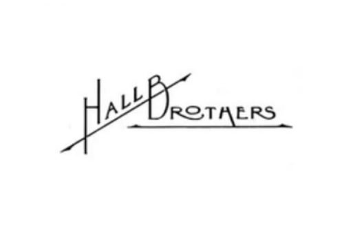
While the greeting cards featured the logo including the word “Hallmark,” there was also an alternative logo showcasing the lettering “Hall Brothers” in a creative type. To each of the words, a long bar with arrows on both ends was added.
1949
The logo now featured the lettering “A Hallmark Card” in a style looking pretty similar to that on the previous version.
1952
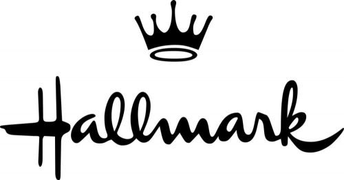
This is when the iconic “crowned” logo was born. The design team was led by a New York-based lettering artist and designer Andrew Szoeke. He started working on the project in 1949. While the “handwritten” wordmark topped with a five-point crown was trademarked in 1950, it was only in 1954 that the official name of the company became Hallmark Cards, Inc.
1977
The Hallmark logo went through a subtle update making the script lighter and the crown larger.
Font and Color
The elegant title case lettering from the primary Hallmark logo is set in a custom cursive with thick smooth lines of the characters. The closest fonts to the one, used in this insignia, are, probably, Chinal Bold, or Channel, with some modifications of the contours.
As for the color palette of the Hallmark visual identity, it is based on plain black, a timeless color of style, quality, and professionalism. When placed on the products of the company, the logo can be whether engraved or embossed, repeating the color of the background, or printed in black or gold.


