Griffin Communications is a media company headquartered in Oklahoma City, Oklahoma. Isn’t it surprising that, despite the name, it does not have a griffin on its logo? There’s a good reason!
Meaning and history
The company was founded in 1951. Originally, it was started as a subsidiary of an already successful firm Griffin Foods. However, the roots of Griffin’s communication business can be traced back to the radio in the 1930s.
One of the achievements the company’s proud today is the world’s tallest tower (1,565 feet). The brand represents a whole platform of media outlets, including Radio, KWTV/News 9 (CBS affiliate), and the advertising division, to name just a few.
2000 – 2009
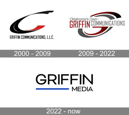
The centerpiece of the previous Griffin logo is the name of the company, where the word “Griffin” is set in maroon, while the word “communications” features gray. The glyphs in the first word are about 30% larger. The type is based on the rectangular shape yet has softly rounded corners.
Above the name of the brand, you can see the slogan “Oklahoma’s Own.” It alludes to the history of the company, as well as the present state of affairs. As the official website explains, the company is “Oklahoma-owned and operated” and “reaches over 90% of Oklahoma households.”
The dynamic “G” in the backgrounds gives the original final touch.
2009 – 2022
The most notable difference is the addition of the 3D gradient, due to which the Griffin logo gets more depth and dynamism.
2022 – Today
The Griffin Communications logo, introduced in 2022, featured a completely new design concept, and signifies a new chapter in the company’s history, following its rename to Griffin Media. The new logo boasts a bold uppercase “Griffin” inscription in a modern softened Sans-serif font, underlined by a thick blue horizontal, starting under the “G” and finishing after the first “F”. The line is followed by the black “Media” in small capitals, set in the same font as the main part of the lettering.
The griffin mystery
While some companies without the word “griffin” in their names have this mythical creature in their logo, Griffin communications have a different approach. Why, after all, their logo does not include the griffin?
The most obvious reason is of course that this mythological creature (also called gryphon) has a very ancient history, and this fact does not work well for a company that is proud of its innovative approach. As you probably know, gryphons appeared in more than one ancient culture. Several representations of gryphon-like hybrids can be found in Ancient Iranian and Ancient Egyptian art created before 3000 BC.
And here another question arises – why would such a company have this word in its name at all?
The reason is simple – it was the second name of one of the key people (one of the co-founders, John Toole Griffin). Even today, the official website states that the brand belongs to David and Kirsten Griffin, as well as John and Ashley Griffin.


