

![]() Greubel Forsey Logo PNG
Greubel Forsey Logo PNG
The high-end watch brand Greubel Forsey was founded in 2001 by Robert Greubel and Stephen Forsey. It has had one logo update so far.
Meaning and history
![]()
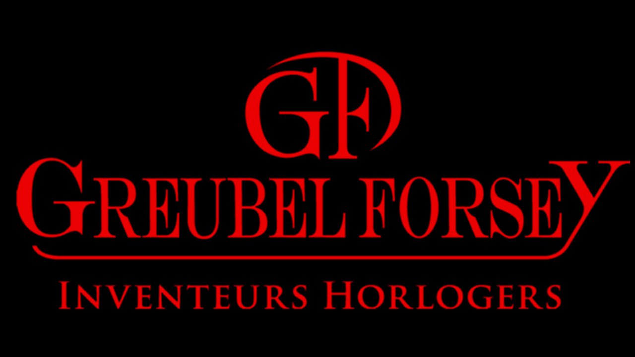
The original Greubel Forsey logo can be clearly seen on their first invention, the Double Tourbillon 30°, which was unveiled at Baselworld in 2004. It featured large interlacing letters “G” and “F” in gold. The “F” had a decorative curve stretching above both the letters. Below, there was the name of the brand in a customized serif type in black. Here, the end of the “Y” was extended to form an underline below the name of the brand. The same emblem could be seen on the face of their second invention, the Quadruple Tourbillon.
Updated emblem
![]()
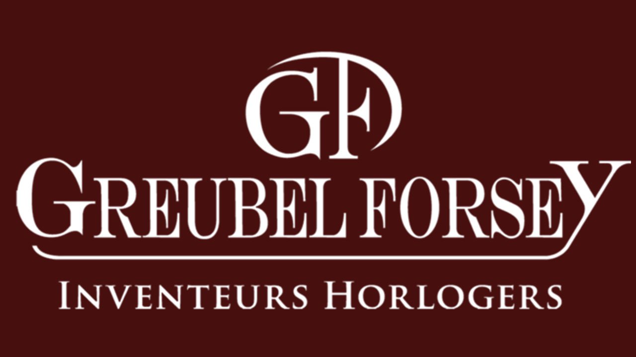
As a result of the latest logo modifications, the interlacing initials have disappeared, while the type used for the name of the brand has become simpler. The extended end on the “Y” is gone, while all the other letters became somewhat wider. The letters now have more breathing space between them and also are of the same height. Below the lettering “Greubel Forsey,” the text “Art of Invention” can be seen. Here, “of” clearly stands out because it’s given in a completely different type and is placed outside the line.
Font
The logo combines two typefaces. While the name of the brand is given in a more elaborate serif type, the slogan features a clearer sans serif one.
Colors
While the Greubel Forsey logo is typically black and white, the word “of” can be given in red.


