

![]() Corum Logo PNG
Corum Logo PNG
Corum is a brand of luxury watch manufacturing company, which was established in 1955 in Switzerland. The brand became famous after the release of its Admiral series of watches and after they created the World Series of Poker collection.
Meaning and history
![]()
The Corum visual identity is a reflection of the luxury company, which is known for its high-end quality watches all over the world.
The Corum logo is composed of a wordmark with an emblem above it. The nameplate in all the capitals is executed in an elegant and bold custom typeface with slightly visible serifs and a finely curved tail of the letter “R”.
Both “C” and “O” of the inscription have their inner contours oval and diagonal, which makes the logo instantly recognizable and unique.
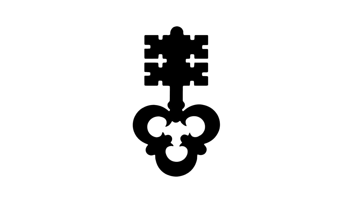
The Corum emblem is a vertically located ornate key, which is pointing up, reflecting the timeless quality and design of the company’s watches and a very well-kept secret of the famous watchmakers.
The elegant and sleek emblem perfectly balanced the brand’s wordmark and creates a sense of mystery and a luxurious approach to everything the company does.
There are two color palettes Corum uses for its visual identity — monochrome and a gray-beige on white, which looks calm and evokes a sense of confidence and a quality-centered brand.
The Corum visual identity is strong and remarkable, it fully reflects the company’s profile and nature, evoking a sense of style, comfort, and rich heritage.


