

![]() Bremont Logo PNG
Bremont Logo PNG
Seemingly simple, the logo of Bremont Watch Company has a recognizable identity and style and reflects the brand’s approach to product design.
Meaning and history
![]()
The British watchmaker Bremont is famous for its aviation-themed products. The company was founded in 2002 by Nick and Giles English. The choice of the aircraft theme for their timepieces was absolutely natural as the brothers had been flying aircraft since childhood – their father was an ex-RAF pilot. Both the previous Bremont logo and the current one were inspired by aviation.
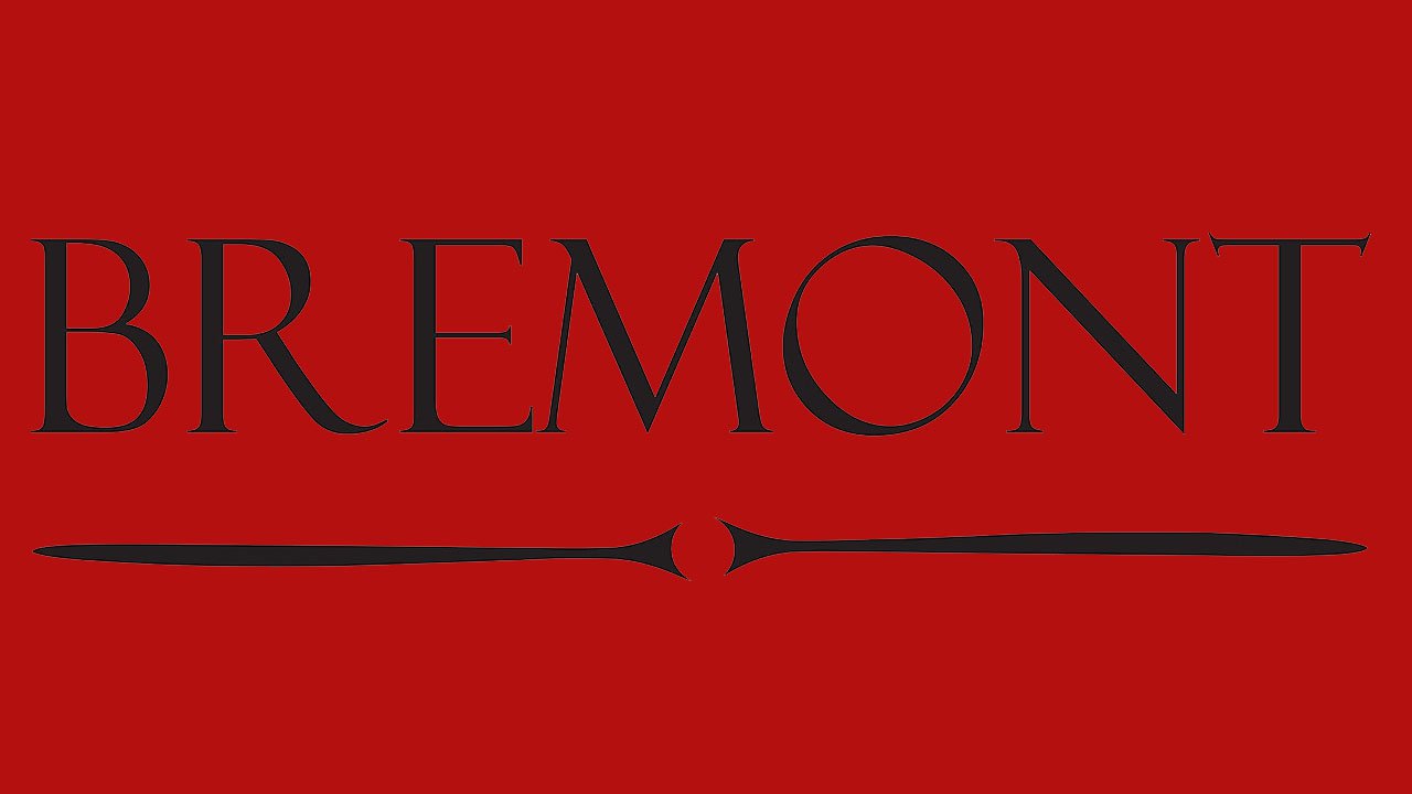
2002 – 2012
![]()
The name of the company on the previous logo was given in an elegant serif type. It did have a retro vibe, which probably symbolized the brothers’ passion for vintage aircraft. Below the lettering, a stylized silhouette of a propeller could be seen.
2012 -2021
![]()
While the typeface became simpler and more modern on the current logo, the propeller itself has grown softer and more refined and adopted an elegant swirl. Below, the lettering “Chronometers” appeared. This word has a long and interesting history and has been used to refer to high-quality timepieces since at least the 1700s. So, it was just another way of emphasizing the brand co-founders’ interest in tradition and precision.
Font
![]()
The minimalistic sans serif type on the Bremont logo looks modern and perfectly legible.
Colors
The regular version is given in black on a white background. However, the company also uses other color combinations when the emblem is placed on watch faces. The wordmark can be, for instance, silver or gold.


