In addition to the obvious explanation, the Green Lantern logo has also a hidden meaning making this symbol more complex and emotionally loaded.
Meaning and history
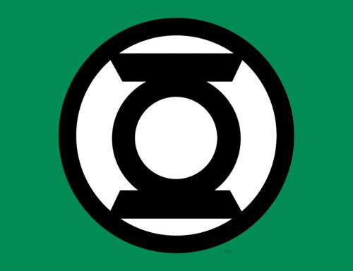
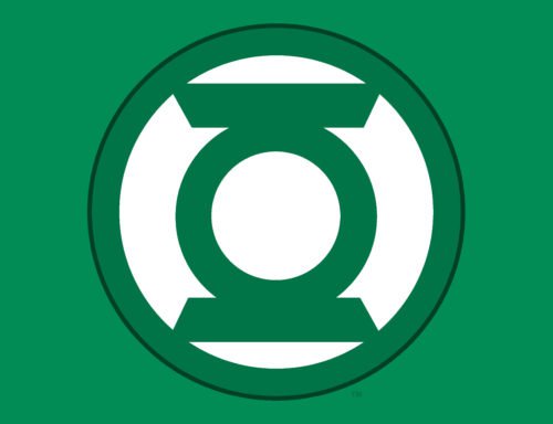
The current emblem is a stylized depiction of a (surprise, surprise!) green lantern. One more interpretation suggests that it also symbolizes an exertion of willpower. In this case, the emblem should be interpreted as a circle forcing two lines apart. Although, at first glance, this explanation may seem far-fetched, it does make sense if you take into consideration the role of willpower for the Green Lantern Corps. For instance, the effectiveness of the power ring depends on the willpower of the person who is wearing it. Also, green is associated with willpower.
Interestingly enough, what we now consider the main Green Lantern emblem wasn’t used in the earliest issues – there was no set logo at the time.
Symbol
The Golden Age Lantern was introduced in All-American Comics #16 in summer 1940. The lettering was made in simple sans-serif type (except the “G”). Each of the 1940-41 issues featured a different lettering.
The cover of the first magazine devoted exclusively to the Green Lantern (1941) featured the elements that would later appear on the logo (most notably, the lantern itself). There has been no official information about the author, but Todd Klein, who has been working in comics for several decades, suggested that it was the Green Lantern artist and co-creator Martin Nodell.
We should definitely point out the Silver Age issue of 1969, where the lantern emblem by Gil Kane appeared, which looked very much like the current one. However, even in earlier issues one could notice a similar emblem on the superhero’s chest (drawn by Ira Schapp).
Emblem
While the issue # 123 in 1979 made a decisive step toward using a simplified and modern Green Lantern logo, the following magazines returned to the more intricate versions. In the course of time, however, they were being replaced by the minimalistic lantern symbol more and more often.
Font
Unlike the lantern emblem itself, the wordmark has been completely overhauled with every new issue. It has been typically based on a hand-drawn lettering rather than an existing font.
Color
While the lantern itself is always green, it can be given on a variety of backgrounds. The most common one is white, while alternative backgrounds are typically light. Earlier versions, though, included other color schemes, for instance, a black lantern on the green background, or a dark blue emblem on the light green background.


