GQ is a monthly men’s magazine, based in New York, USA. It was founded in 1931 and focuses on style, popular entertainment and news stories.
Meaning and history
In 1958 the popular magazine was known under the name Gentlemen’s Quarterly. Gentlemen’s Quarterly was re-branded as GQ in 1967. The rate of publication was increased from quarterly to monthly in 1970.
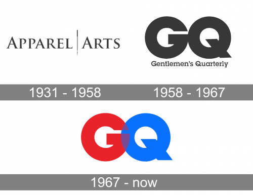
1931 – 1958

The very first logo was created for the magazine in 1931 when its name was “Apparel Arts”. The logo featured an elegant and chic inscription in the uppercase with both first letters “A” slightly enlarged. The two words of the nameplate were separated by a vertical stylized line. The whole composition was executed in monochrome, which made it timeless and sophisticated.
1958 – 1967

After the magazine was renamed in 1958, the new logo was created in the same year. And this is when the predecessor of the current iconic emblem appeared. Two enlarged black “GQ” letters were placed very close to each other and set above the “Gentlemen’s Quarterly” tagline in a title case of an extended modern serif typeface.
1967 – Today
GQ is a trendy and classy men’s magazine, it focuses on style and fashion tips, popular entertainment and news stories, sex and relationship advice, and other male-centric topics.
Being inspired by New York, GQ features mens’ fashion and style, and utilized different fonts to feel contemporary and hip.
For its logo GQ uses a bold typeface based on RTF Amethyst Light Italic. The GQ logo is usually black, but one more color scheme used by the brand is blue and red, where “G” wears scarlet red and “Q” – bright blue.


