Google Play is a digital market platform, where you can buy or sell apps for certified devices running on the Android operating system and its derivatives, and also on Chrome OS. The brand was launched in the spring of 2012. It originated from three platforms: Android Market, Google Music, and Google eBookstore.
Meaning and history
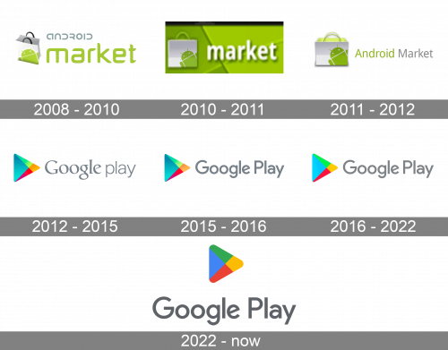
The history of the brand can be broken down into two distinctive periods. From 2008 to 2012, it existed under the name of Android Market. In 2012, it adopted the current name, and the first Google Play logo was introduced. Ever since, the updates have been comparatively subtle.
What is Google Play?
Google Play is the most important and popular application, used by all the devices on the Android operation system. Launched in 2012, the service connects users to app developers, letting them buy or download for free various applications for their mobile phones or tablets.
2008 – 2010
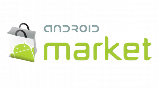
Let’s trace the evolution of the design back to the original logo of Android Market. The only similarity we can notice with the Google Play brand identity is the use of gray color. Although in the case of Android, there is a slightly warmer shade. It was chosen to fit the warm grass green, which is the dominant color here as it is used for the largest element of the design, the word “Market.”
The type used for the lettering “Android” was highly distinctive. It was dominated by the horseshoe shape (or “U” shape), which was used as the basis for almost all the glyphs. The shape was inspired by Bugdroid, which is the green robotic icon sometimes called Android’s mascot (though, in fact, it doesn’t officially hold this status). Bugdroid was drawn by Irina Blok, a Russian-born graphic designer who worked for Google back then.
Bugdroid is, of course, here, on the logo. The creature is depicted on the open shopping bag positioned to the left of the wordmark.
2010 – 2011
The bag grew flatter in the following version, and it didn’t look open anymore, though Bugdroid was still there. The type used for the word “market” became more generic, as did the overall design.
2011 – 2012
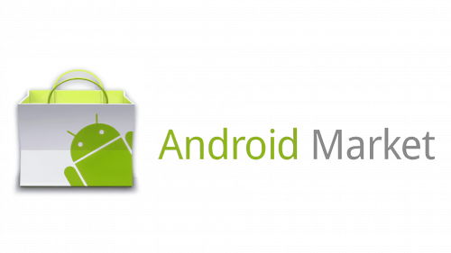
The bag adopted an additional dimension and was “open” once again. This time, there was a mystic green light coming from within. The name of the brand was now positioned within a single line.
2012 – 2015 (still used in several countries)
The brand was renamed and parted company with its previous visual identity. Instead, a sleeker design was introduced.
The brightest part of the Google Play logo was the triangular shape occupying its left-hand side. The shape, which was inspired by the play button, consisted of three partly overlapping semi-transparent triangles. The difference in their shapes, proportions, and colors created an unusual watercolor effect.
The wordmark was gray, and it wasn’t even trying to outshine the emblem. Yet, it was remarkable in itself due to the distinctive serifs. The two words forming the name of the brand featured different typefaces, which only reinforced the unusual impression.
2015 – 2016
The combination of serif typefaces was replaced by a single type named Product Sans, which is Google’s custom font created specifically for the logo.
2016 – 2022
Gone were the muted watercolor hues. Instead, we see vivid, energetic, highly straightforward colors – blue, red, green, and yellow. They are balanced by the calm gray of the wordmark, which has preserved its typeface.
2022 – now
Colors and font
The palette of the Google logo is more about diversity than about the meaning of the separate colors. It is an ode to the wide range of apps on offer.
The custom type Product Sans, in spite of its simplicity, has a couple of distinctive features. Note, for instance, the shortened top end of the “G.”
What is Google Play
Google Play, also known under the name of the Google Play Store, is an online store offering Android apps, as well as an endless range of games, movies, TV shows, books, etc. The market works in around 190 countries in various corners of the globe.


