

 Cartoon Pizza Logo PNG
Cartoon Pizza is an animation company located in Nashville, Tennessee, U.S. It was co-founded by Jim Jinkins (animator, author) and David Campbell (TV writer, producer).
Meaning and history
![]()
Cartoon Pizza is an animation studio founded by Jim Jinkins and David Campbell in 2001 as a replacement for the popular 1990s studio Jumbo Pictures. Jumbo Pictures, was established in 1988 and was one of the American pioneers in animated tv-series, and Cartoon Pizza became its quite successful successor.
Throughout the years’ Cartoon Pizza has been collaborating with Disney and Sesame Workshop, creating its animated projects in parallel. But in the middle of the 2010s, something went wrong for the studio, and in 2015 it ceased all operations. However, in 2016 the Cartoon Pizza company came back to the stage.
What is Cartoon Pizza?
Cartoon Pizza is the name of an American animation studio, which was established in 2001. The most famous products of the studio are Stanley, JoJo’s Circus, and Punky Dinky Doo. But apart from its own projects, the studio has had many collaborations with such giants in entertainment as Disney and Sesame.
1991
![]()
We should start the story of the Cartoon Pizza logo from the earliest period in the company’s history. Or, to be precise, the history of its predecessor, Jumbo Pictures, Inc., which was also a Jinkins’ company.
One of the reasons for this approach is that the two emblems have something in common. They both feature the name of the company written over a rounded object (in the case of the Jumbo Pictures logo, this object is an egg). Also, they both contain something edible (again, the egg in the case of Jumbo).
2001
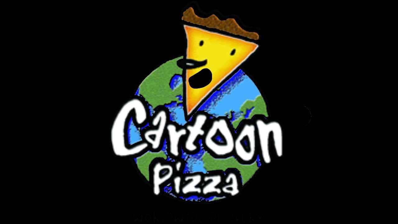
The structure has preserved the same. You can see the brand’s name in the forefront. Here, it is comparatively small and is given in white. The type is playful, with the letters dancing and jumping up and down.
The most eye-catching element is the “live” slice of pizza above. It has a face, with a prominent nose and a smile. The “hair” is formed by the edge of the pizza.
In the background, the globe can be seen. It looks pretty realistic, with the green land and blue oceans.
While there has been some playing around with the shades and the background, the overall look of the Cartoon Pizza logo has remained unchanged through the years.
Font and Color
The funky handwritten lettering from the primary Cartoon Pizza badge is set in a bold and custom typeface with softened contours of the title case characters. The closest fonts to the one, used in this insignia, are, probably, Typographic Onedalism, or ITC Airstream Std Regular, but with some significant modifications of the characters’ contours.
As for the color palette of the Cartoon Pizza visual identity, it is based on a combination of green, blue and yellow, where the first two shades are used to represent our planet and yellow stands for pizza. The palette is accompanied by black and white, colors, which add professionalism and confidence to the whole composition.


