

![]() GoDaddy Logo PNG
GoDaddy Logo PNG
GoDaddy is an online platform, specialized in selling and hosting domains. The website was launched in 1997 and today has over 18 million users worldwide. GoDaddy is one of the most popular domain registrar companies.
Meaning and history
![]()
Bob Parsons founded GoDaddy in 1997 as Jomax Technologies. Two years later, the company was looking for a more memorable name and brainstormed with employees. The name “Big Daddy” was suggested, but that domain was taken. The idea turned into GoDaddy.
Today GoDaddy employs about 9,000 people and serves more than 20 million customers in many countries. The company focuses primarily on small businesses: sole proprietors and small companies.
In addition to domain registration, GoDaddy offers hosting servers, a website builder, and automated tools for website promotion. In addition, the company acts as a corporate email provider with email marketing capabilities.
What is GoDaddy?
GoDaddy is a web hosting and Internet domain registrar, and the primary concern of GoDaddy Inc. Founded in 1997 by Bob Parsons, GoDaddy has become the world’s largest ICANN-accredited domain registration company with over 82 million domain names under its management.
1997 — 2016
![]()
The earliest GoDaddy logo showcased the name of the brand in a casual script. The words were written by hand but not in a cursive script (the glyphs were separated from each other).
The highlight of the logo, though, was not the wordmark but the emblem. There was a head wearing fun green glasses. The orange hair was highly stylized. Also, the head was wearing a five-pointed yellow star on the side.
2016 — 2018
![]()
The head grew smaller in comparison with the wordmark, which was now executed in a heavy sans with slightly rounded corners. The lettering grew better legible but lost its uniqueness. Also, it looked too serious to merge with the laidback style of the emblem.
2018 — 2020
![]()
The head disappeared – only the green color of the wordmark was now to remind of it. The type was the same as in the previous version.
2020 — Today
![]()
The GoDaddy visual identity, redesigned in 2020, is modern and elegant. It reflects the progressive and dynamic company, leaving a lot of space for imagination.
The GoDaddy logo is composed of a wordmark and an emblem on its left. The inscription is executed is a strong sans-serif typeface, which has distinct and neat lines. The only unique element of the GoDaddy lettering is the “G”. The first letter features an arrow on the end of its tail, which symbolizes the progressive and innovative approach of the company.
The GoDaddy emblem is formed from two letters, “G” and “O”, having similar oval shapes and overlapping each other. The letters form and abstract heart-shape figure, which the company uses in various stylizations in their advertising animated videos.
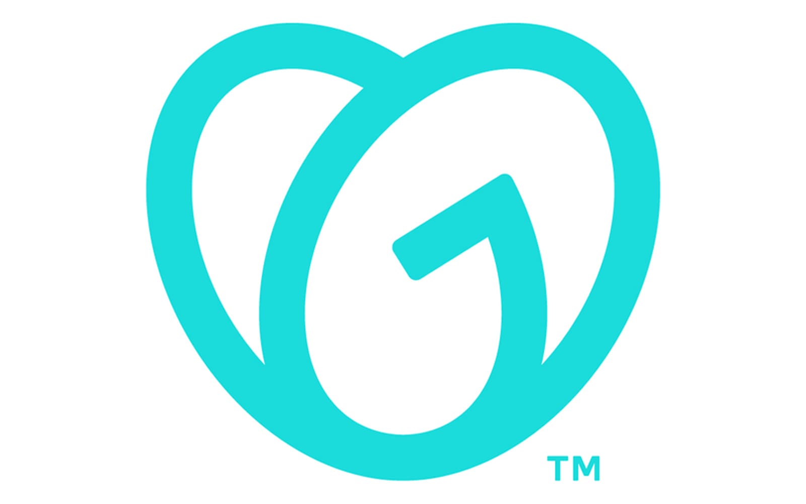
The GoDaddy color palette is turquoise on white; which is a symbol of energy, creativity, and good luck. Turquoise also stands for friendship and loyalty, two qualities, which are important for GoDaddy.
Font and Color

The stable and dynamic lettering from the primary GoDaddy logo is set in a modern geometric sans-serif typeface with the stylized letter “G”, which adds uniqueness to the bold yet simple style of the inscription. The closest fonts to the one, used in this insignia, are, probably, Galano Grotesque Bold, or Montreal Serial Bold, but with the letter “G” getting its tail drawn as an arrowhead.
As for the color palette of the GoDaddy visual identity, it is based on a bright and juicy shade of turquoise, a color of joys and action, and a very unusual shade; which makes the company stands out in the list of its competitor. Turquoise evokes a sense of motion and progress, and at the same time represents the trustworthiness and responsibility of the brand.


