GlaxoSmithKline (GSK) is a British pharmaceutical company, one of the biggest pharmaceutical groups in the world. Founded in 2000, the company specializes in a broad range of therapy areas but is particularly successful in the fields of HIV/AIDS, respiratory and vaccines.
Meaning and history
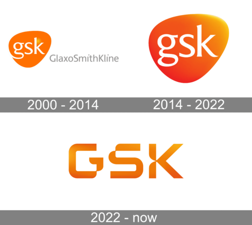
GSK, or GlaxoSmithKline, an international company, was formed through the merger of Glaxo Wellcome and SmithKline Beecham in January 2001. The company operates in more than 150 countries. GSK has 84 plants in 36 countries. The largest research and development centers are opened in Great Britain, the USA, Belgium and Spain. More than 13 000 of 98 000 employees are the employees of scientific laboratories.
Major sales are provided by drugs in therapeutic areas: respiratory diseases, cancer, HIV/AIDS, diabetes, mental disorders, prevention of infectious diseases (vaccines for different age groups), drugs sold in pharmacies by physician recommendation (Augmentin, Becotid, Zinacef, Zinnat, Fortum, Energin, etc.) and symptomatic drugs sold in pharmacies without prescription (Panadol, Coldrex, Solpadein, etc.).
What is GlaxoSmithKline?
GlaxoSmithKline is the name of an international pharmaceutical research company, which was established in the beginning of the 2000s. The company operates globally and is known to be one of the leaders of the pharmaceutical market, being the world’s second largest pharmaceutical company by sales, after Pfizer.
2000 – 2014
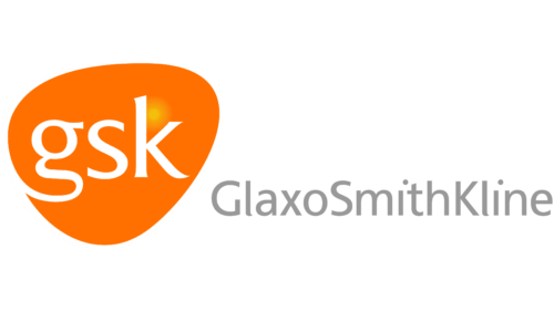
Originally, the main emblem was shaped as a kernel – an orange triangular shape with rounded corners. In its middle, they wrote ‘GSK’ in white lowercase letters. The font was a strict, elegant serif. On the emblem’s right, they also put the full name written in smooth grey letters.
2014 – 2022
The GSK logo is a bright orange tablet-shaped emblem with the company name written in white Frutiger typeface. The GSK tablet shape also resembles the anatomical shape of the heart.
The gradient orange emblem contrasts perfectly with its black background, and the combination of orange and white expresses the company’s striving to do goo to its customers and provide high quality products.
The GSK logo is one of the most recognizable in the industry. It was designed by a London based Future brand agency.
2022 – Today
Font and Color
The elegant lowercase lettering from the primary logo of GlaxoSmithKline is set in a classy bold font with sharpened ends of the elongated lines of the characters. The closest typefaces to the one, used in this insignia, are, probably, Majesty Regular, or RT Singular Regular, with some minor modifications of the contours.
As for the color palette of the GlaxoSmithKline visual identity, it is based on gradient shades of orange, a color of energy and happiness, with the white accents to represent reliability and trustworthiness. The bright and juicy color scheme makes the company stand out in the list of its competitors.


