

![]() Girard-Perregaux Logo PNG
Girard-Perregaux Logo PNG
The history of the high-end Swiss watch manufacturer Girard-Perregaux started more than 225 years ago, while its logo has been altered at least 25 times.
Meaning and history
![]()
The brand’s roots can be traced as far back as to 1791, when watchmaker Jean-François Bautte signed his first timepiece. Today, the company produces a range of movements, watches, cases, and bands. It belongs to the Sowind group.
Emblem evolution
Whatever changes the logo has gone through, it has always stayed a wordmark-based emblem. Only one version of the emblem has had a pictorial element in it – a small watch. All the others have just played with the typeface, the size and texture of the letters, as well as all kinds of outlines. In some cases, the letters looked quite plain, while other versions featured elaborate scripts.
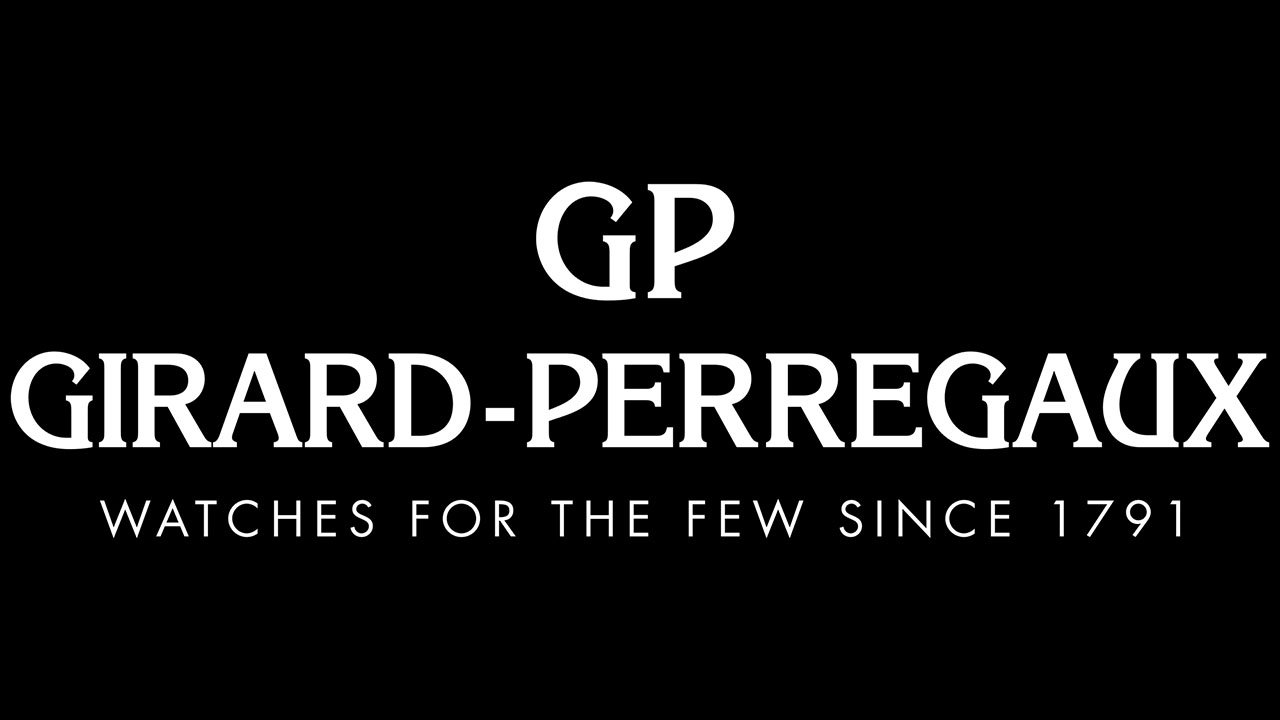
Current symbol
Above the brand name given in an elegant serif type, there’s the lettering “GP.” Below, you can see the slogan “Haute horlogerie suisse depuis 1791” in a simpler sans serif type.
Font
![]()
The typeface featured on the current Girard-Perregaux logo looks pretty similar to the slab serif type TC Korinna, which was developed by Edward Benguiat and Victor Caruso.
Colors
The black wordmark stands out on the white background. This color scheme is the one that is used most often. Other choices are possible when the emblem appears on watch faces.


