

![]() Germany National Football Team Logo PNG
Germany National Football Team Logo PNG
The German National Football Team is the official representative of the Federal Republic of Germany in international competitions. Winner (1954, 1974, 1990, 2014), Silver (1966, 1982, 1986, 2002) and Bronze (1934, 1970, 2006, 2010) World Cup medalist, Winner (1972, 1980, 1996), Silver (1976, 1992, 2008) and Bronze (1988, 2012, 2016) European Championships, Winner of the Confederations Cup (2017).
Meaning and history
![]()
Before the formation of the national team, the teams that represented Germany played 5 unofficial matches against English teams. At the beginning of the twentieth century, the German Football Association (DFB) was formed. However, the debut official match took place only in 1908 against Switzerland (Switzerland 5:3 Germany).
The first high-profile victory came in 1954 when the Germans faced the Hungarians in the final at Switzerland’s Wankdorf Stadium in Bern. Germany literally snatched victory through a display of indomitable character and will to win.
The Germans won the World Cup for the second time in 1974, defeating the Dutch. At the same tournament, they were awarded the Fair Play prize for their fair, honorable play and respect for their opponents. Then glory awaited them in 1990 when in the final the Bundestim beat the Argentines, led by Diego Maradona himself.
In addition, the Germans became European champions 3 times and won several consecutive silver and bronze medals at both championships. In terms of the total number of titles, the Bundestim currently holds the palm of superiority on the planet.
Germany is considered one of the main favorites for the European trophy. It is understandable, the Germans are three-time winners of the European Championship. However, the euro gold medal has not been conquered by the German National Team for a long time. Germany won the title in 1972, in 1980, and in 1996.
As for the visual identity, the Germans approach it as strictly and technically as they do the game on the pitch. The modern emblem is a mix of the historical logo of the German Football Association, the coat of arms, and stars (four – one for each gold medal).
1908 – 1912
![]()
From the very first team emblem, unveiled in 1908, the centerpiece of every logo has been the national symbol, a Black Eagle with wings spread and plumage down, with a blackened beak, tongue, paws, and talons, looking to the left – it came directly from the German coat of arms.
1912
![]()
In 1912 the classic crest shape of the team’s logo was changed to a more laconic one, and now the black heraldic eagle was placed directly on the uniform of the players, without any framing of geometric backgrounds.
1924, 1952, 1972 – 1988
![]()
A completely different emblem was designed for the German team in the middle of the 1920s. It was a very stylish and bold crest in a dark yellow and black color palette with the red elements of the eagle.
1926 – 1927
![]()
The emblem from the season 1926 featured a black and white composition with the heraldic eagle drawn on a white background and enclosed into a black circular frame.
1927 – 1929
![]()
The first lettering appeared on the team’s logo in 1927. Some Sportiness was added to the Eagle, with the inscription “German Football Association” ( Deutscher Fußball-Bund). Also, some elements of the bird were colored yellow.
1929 – 1934
![]()
Yellow was removed from the German National Football Team logo in 1929. The circular frame of the emblem was now set in solid black, and the lettering turned white, emphasizing such features of the team as strength, confidence, and determination.
1934 – 1938
![]()
One of the two most controversial emblems was designed in 1934. The eagle was redrawn in a more modern style with wings spread wide apart. The bird was drawn with a black outline on a white background without any framing, and its paws touched a round medallion with a swastika in the middle.
1938 – 1942
![]()
The redesign of 1938 introduced a bright red rounded crest with a black eagle on it. The national symbol from this version was somewhat in the middle of the original heraldic image and the modern interpretation from 1934. The body of the eagle was overlapped by a large swastika symbol in gray with a white outline. The logo was used until 1942.
1950 – 1962
![]()
After the war, the National Football Team of Germany has returned to its original emblem, with the black heraldic eagle inscribed into a circular medallion with a wide frame, where the “Deutscher Fussball Bund” lettering was written in the uppercase of a clean sans-serif typeface.
1966 – 1970
![]()
In 1966 the frame of the medallion became wider, hence, the size of the characters was now larger, and the graphical element, on the contrary, smaller. The eagle was redrawn in a more ornate style with lots of details.
1970 – 1974
![]()
The redesign of 1970 has brought back the image of the eagle, introduced in 1950, however, the lettering around the badge’s perimeter was rewritten. The font became a bit narrower and the bars of the characters — thicker.
1974 – 1978
![]()
And again, with the next redesign the lettering changed its style. It was a geometric sans-serif typeface with straight cuts of the bars, however, the new inscription looked lighter than the previous one and had more air inside and between the characters.
1978 – 2003
![]()
The redesign of 1978 was mainly about the head of the eagle. The body of the heraldic bird stayed almost untouched, but the contours of its head got more laconic and bold. In 1996 the three five-pointed stars in black, red, and yellow were added above the crest to celebrate the three wins of the team in the World Cups (1954, 1974, 1990).
2003 – 2008
![]()
In 2003 the emblem of the German National Football Team got another outline. It was a thin black ring with the bottom part stylized: it was cut into three equal strokes in the colors of the German flag, black, red, and yellow. To balance the new element, the stars above the badge were now set whether in silver or gold.
2008 – 2014
![]()
The redesign of 2008 has also played with the new outline of the emblem. Now it got thicker and changed its color from black to solid gray. With the thickening of the frame, the three arched lines in black, red, and yellow were also emboldened, adding more patriotism to the composition.
2014 – 2021
![]()
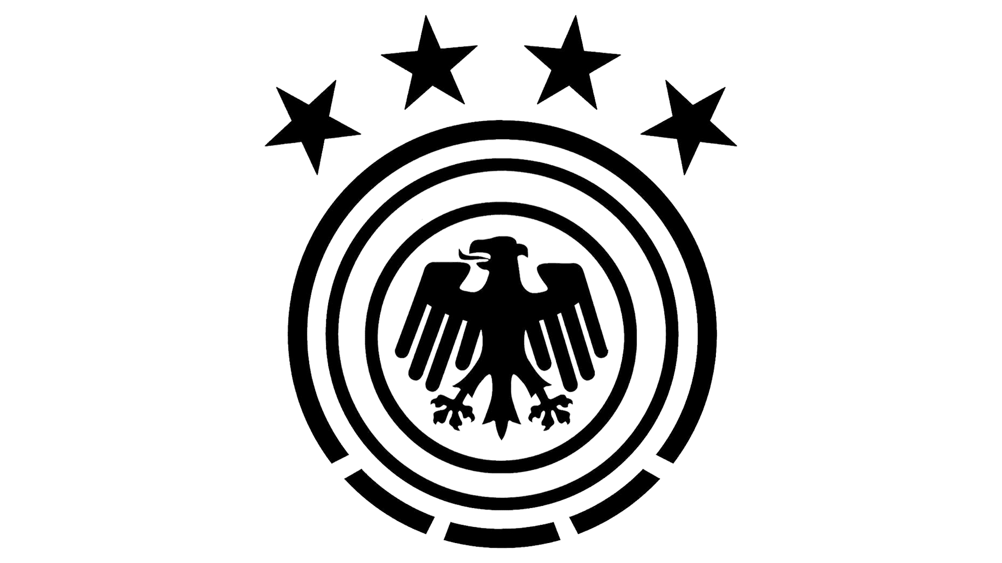
In 2014 the German National Team won another World Cup, so the fourth star was added to the composition. The main emblem remained absolutely the same, but the four five-pointed stars above it were now colored in a darker shade of gold.
2021 – Today
![]()
The redesign of 2021 has completely changed the color palette of the German National Football Team logo, redrawing it in gradient glossy gold, with no colorful accents. As for the composition, it remained completely the same, but the lettering around the frame got a bit bolder.
Font and color
The bold uppercase lettering from the official emblem of the German National Football Team is set in a geometric sans-serif typeface, which looks pretty close to such commercial fonts as Futurareg or Starfire.
As for the color palette of the team’s visual identity, since 2021 it was minimized to gold and white, a combination, which evokes a sense of excellence and professionalism.


