

![]() Porto Logo PNG
Porto Logo PNG
Porto is the name of one of the most successful football clubs from Portugal which was established in 1893. Today the club, nicknamed “Dragons” (which is “Dragōes” in Portuguese) is managed by Jorge Nuno Pinto da Costa and has Sergio Conceiçao as the head coach.
Meaning and history
![]()
The history of the Porto logo is not very long, as the legendary club managed to find their perfect emblem already in the early 1920s, and since then it was only slightly modified throughout the years. As for the first two versions of the badge, they were pretty simple, yet their shape and color palette became a basis for all the following redesigns.
1908 – 1913

The very first Porto FC logo was created in 1893, the same year when the club was established. It was a solid blue circle with a white “FCP” monogram. The bold over-lapping each other letters were executed in a smooth rounded typeface with tails slightly curved. Each of the symbols had a thin black outline. This version was simple yet bright and confident.
1913 – 1922

The redesign of 1910 brought a more modern badge to the Portuguese team. The blue circle turned into a blue football with white stitched, and a bold white “FCP” let-tering in strict geometric sans-serif on it. This logo became a part of the iconic Porto badge we all know today.
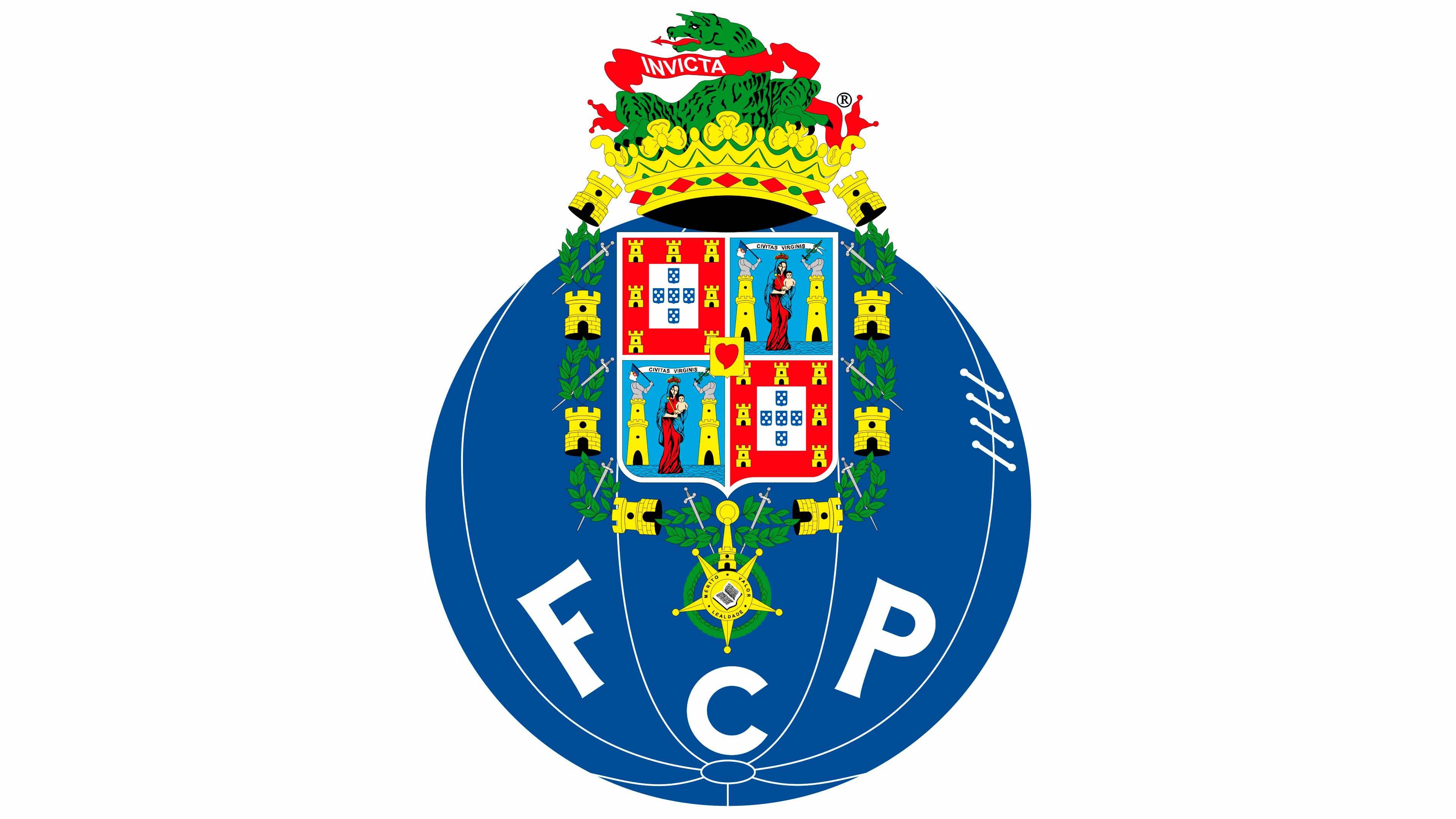
1922 – 1970
![]()
The logo, created in 1922 was composed of the blue football from the previous ver-sion and an ornate red and gold crest, the official coat of arms of the Porto City.
The colorful and chic crest was placed on the upper part of the ball, and the “FCP” lettering in the same bold sans-serif was moved from the center to the bottom edge of the football. Each letter was placed in a separate segment.
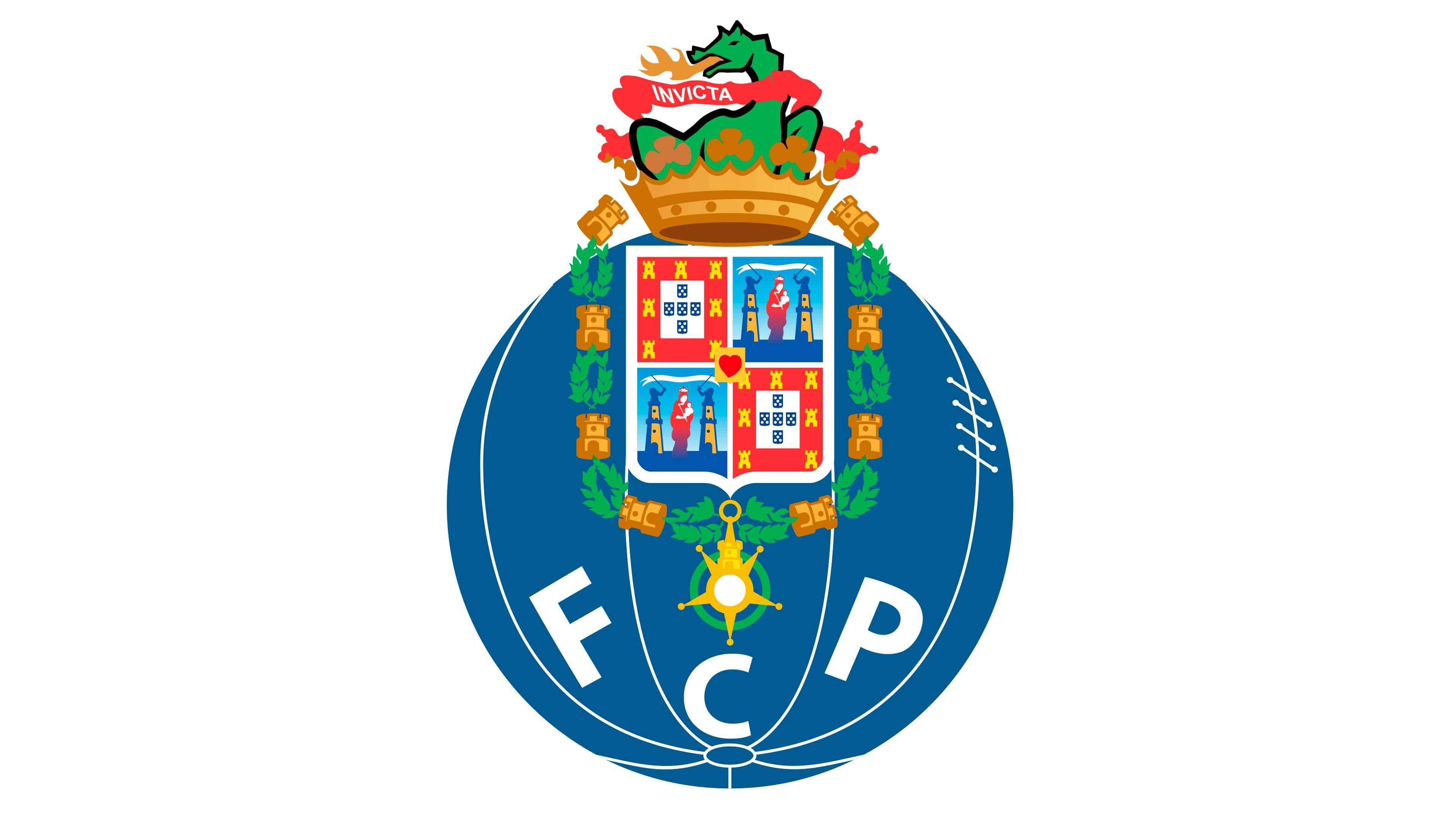
1970 – 1986
![]()
The official coat of arms of Porto City was redrawn and had more details as well as more orange. The red ribbon on the dragon now held a barely noticeable inscription “Invicta”, which means invincible, undefeated, or unconquered in Latin. Although it can refer to the fact that Porto can be known as the Invicta, meaning that the city was never defeated, it can also describe the strength and professionality of the team. Undoubtedly, it was all the small details that made all the difference.
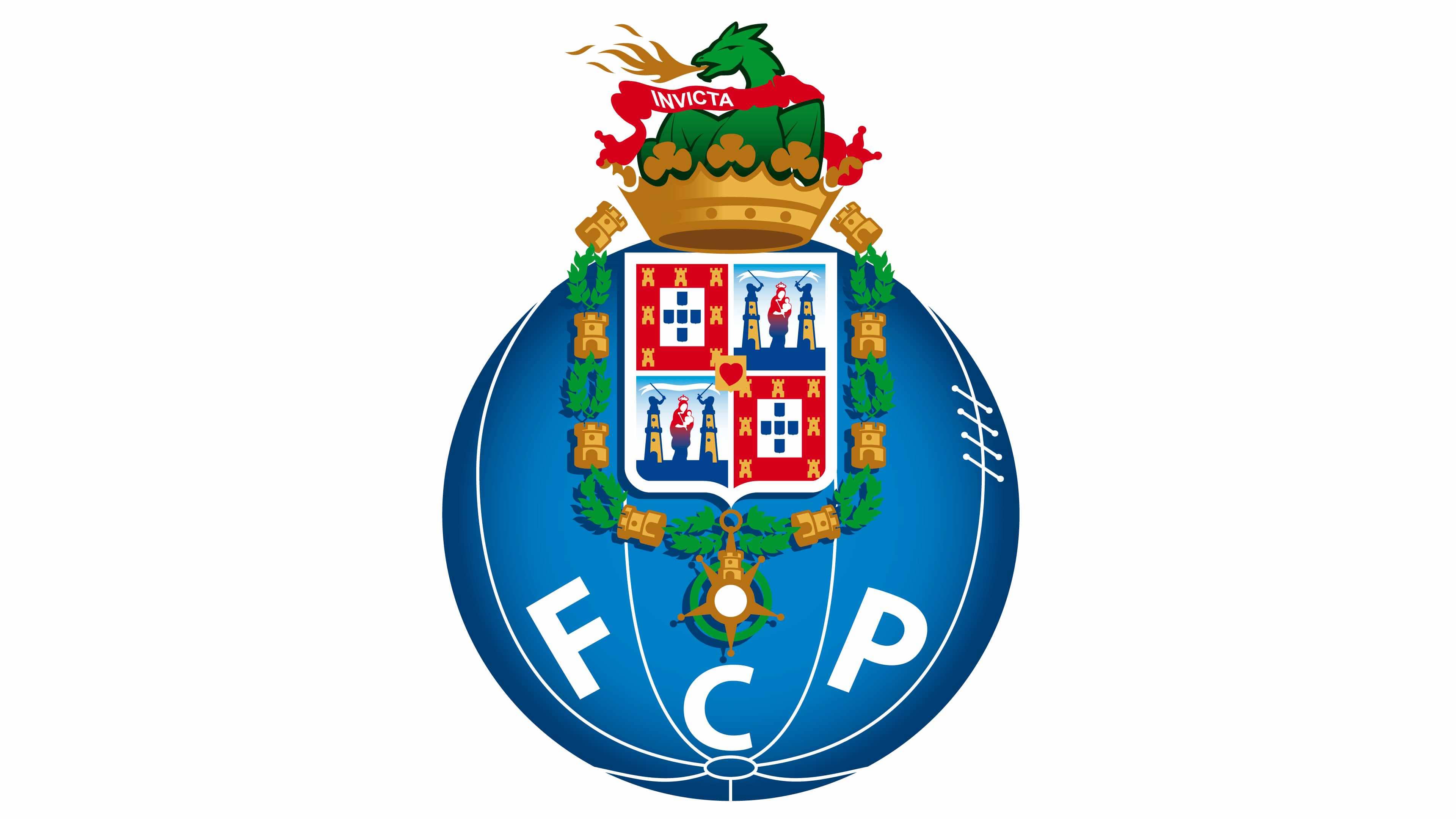
1986 – 1995
![]()
The new logo looks significantly darker, although all the key elements were preserved in one way or another. One of the most noticeable changes was the enlargement of the “FCP” letters, so they no longer got lost in all the details of the logo. The muted, darker color palette gave the logo a more serious appearance and supported the “Invicta” motto written at the very top.
1995 – 2002
In 1995 the logo was redrawn in brighter and more vivid colors. The dark gold be-came light yellow and the red and blue fragments of the shield were now more visible and detailed.
The “FCP” inscription was also redesigned in a more modern way, with stronger and cleaner lines.
2002 – 2010
The black details were removed from the crest and now the whole logo started looking smoother and more balanced. The lettering was changed again, getting en-larged and straightened.
2010 – 2017
The football gains gradient shades and the crest — light shadow in 2010. Now the logo looks three-dimensional and evokes a sense of motion and dynamics. The crest itself was cleaned and refined, as well as the ball and its white lines and stitches.
2017 – Today
![]()
The redesign of 2017 only made the football slightly darker, and the whole image started looking more serious and professional.
The iconic Porto logo is elegant and bright, it evokes a sense of excellence and au-thority, showing the roots of the club and their fundamental approach to everything they do.
The blue football resembles a globe, and it makes sense, as Porto FC is known and loved by people from all over the world.
Porto Colors
BLUE
PANTONE: 2945 C
HEX COLOR: #00428C;
RGB: (0, 66, 140)
CMYK: (100, 84, 16, 3)
WHITE
PANTONE: PMS P 1-1 C
HEX COLOR: #FFFFFF;
RGB: (255, 255, 255)
CMYK: (0, 0, 0, 0)
RED
PANTONE: 185 C
HEX COLOR: #D60019;
RGB: (214, 0, 25)
CMYK: (10, 100, 100, 2)
GREEN
PANTONE: 355 C
HEX COLOR: #009634;
RGB: (0, 150, 52)
CMYK: (85, 15, 100, 3)
GOLD
PANTONE: 142 C
HEX COLOR: #E9B245;
RGB: (233, 178, 69)
CMYK: (9, 31, 85, 0)


