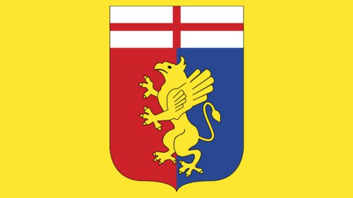
Genoa Cricket and Football Club boasts the oldest of all currently playing football teams in Italy as its history dates back to 1893. The club’s brand identity is connected with the symbols of its home city, Genoa.
Meaning and history

The English who lived in the city founded the Genoa Cricket and Athletics Club on September 7, 1893. Initially, its members were exclusively British. On April 10, 1897, James Richardson Spencely opened the club’s football group. Thus, the Genoese team among all Italian clubs is second in age only to both Turin teams. The Italians were allowed to join, and the headquarters was moved to Ponte Carrega. Particular fame came to Genoa on April 27, 1903. On this day, the Genoese were the first of all Italian teams to play a match with a club from another country. In 1928, under the influence of the fascist government, Genoa was forced to change its name to Genova, erasing even a hint of English roots, but justice prevailed after the collapse of Mussolini’s regime.
What is Genoa?
Genoa CFC, an Italian football club, is one of Italy’s oldest and most prestigious teams. Founded in 1893, it has a rich history marked by numerous successes, including nine Serie A titles. Known for its passionate fanbase and deep-rooted football culture, Genoa continues to be a significant presence in Italian football.
1893 — 1980
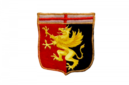
The very first Genoa logo was introduced at the end of the 19th entity and featured an elegant heraldic emblem, with the gradient green rampant griffon placed on a classic crest, vertically divided into red and black halves. The upper part of the crest was white and had a thin Red Cross placed on it, with its horizontal bar elongated, and coming from left to right parts of the frame.
1980 — 1980s
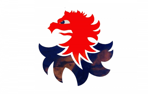
The redesign of 1980 brought a bright and modern emblem to the club. It was now only the heat of the Griffin, executed in Ted and dark blue and placed on a plain white background color without any heraldic elements or crest framings. The creature looked sharp though funny and playful. And showed the progressive approach of the team.
1980s

Later in the 1980s, the Genoa logo was changed again. This time the football club decided to come back to the roots, using the initial holder griffon on a crest concept but redrawn the creature more simply and stylishly and adding a golden football into its hands. As for the background, it was kept as on the logo from 1893, but the upper part now became a bit wider, so the Red Cross got more massive and visible, as well as the thick gold frame of the logo.
1980s — 1991
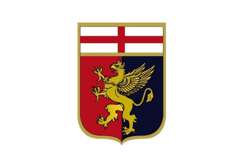
A few years later the griffon badge was redrawn again, and now it was truly a masterpiece. The new crest was professionally executed, with every small detail on the dark gold body of the mythological creature outlined in black and accented. The color palette of the background became a bit darker, which made the whole insignia look stronger, and started evoking the sense of seriousness, royalty, and nobility.
1991 — 1998
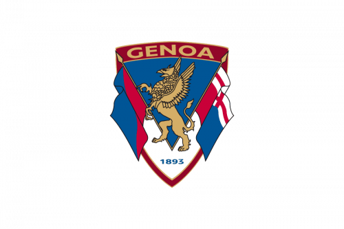
The redesign of 1991 made the badge lighter and simpler. Less royal touches, though the character of the club is still there. First of all, the shape of the crest was changed to a triangular one, and two flags were added to its sides. The griffon was still there but redrawn. The upper part of the logo was now taken not by the Red Cross on a white background, but by a gold “Genoa” logotype in the uppercase, set on a dark burgundy background.
1998 — 2022

This logo version is based on the original logo with a crest split in red and dark blue with a griffon, a mythical creature with the head, claws, and wings of an eagle and the body of a lion, in the center. The griffon was redrawn to have much fewer details and was done in yellow instead of golden. The upper portion was now a clean white color with the crimson cross in the center. A yellow was also used for the outline of the emblem.
2022 — Today

The griffon, which symbolizes dominance over two spheres of being: earth and air, was redrawn again. Besides changing the shape of the creature, the designers removed the black details and outline. This was a great modern interpretation of the original emblem. Another small detail that was different was the length and width of the lines forming the cross. They were shorter and no longer reached the outer edge of the emblem.
Colors
In addition to the colors borrowed from the coat of arms of the city of Genoa (red, white, and gold), the Genoa CFC emblem also features dark blue and black. Black has been used to provide the finishing touch, while blue presumably symbolizes the sea (Genoa is a port city).
Genoa Colors
RED
PANTONE: 2350 XGC
HEX COLOR: #AD1919;
RGB: (173, 25, 25)
CMYK: (22, 100, 100, 15)
DARK BLUE
PANTONE: 303 C
HEX COLOR: #05232F;
RGB: (5, 35, 47)
CMYK: (91, 71, 56, 65)
YELLOW
PANTONE: YELLOW 012 C
HEX COLOR: #FFD400;
RGB: (255, 212, 0)
CMYK: (1, 14, 100, 0)
WHITE
PANTONE: P 1-1 C
HEX COLOR: #FFFFFF;
RGB: (255, 255, 255)
CMYK: (0, 0, 0, 0)


