

![]() Rennais Logo PNG
Rennais Logo PNG
Rennais, or Stade Rennais, is the name of a French football club, which was estab-lished in 1901. Being one of the oldest clubs of France, today it plays in Ligue 1 and is considered to be one of the strongest teams. The club has Julien Stephan as the head coach.
Meaning and history
![]()
The visual identity of the French football club is stylish and instantly recognizable. The club uses the most powerful and classy color palette since almost the very be-ginning of its existence, and the red, white, and black combination not only reflects its strength and professionalism but also makes the team stand out in the list of its competitors.
1900 — 1960s
![]()
The original logo depicts a shield shape. Its top is mostly black and occupied by the words ‘Stade Rennais’. Much of the remaining emblem is white with diagonal hatching. That’s where they put a Hermine – a heraldic symbol of Bretagne, where the club is from.
1960s — 1972
![]()
The next design is a circle shape with a red core and black space surrounding it. Its top quarter protrudes a little bit further, and it’s instead filled with black and white stripes from the Bretagne flag. Right above it, there is also a number of Hermine symbols. The bigger part of the emblem instead accommodates the white letters ‘S’ and ‘R’.
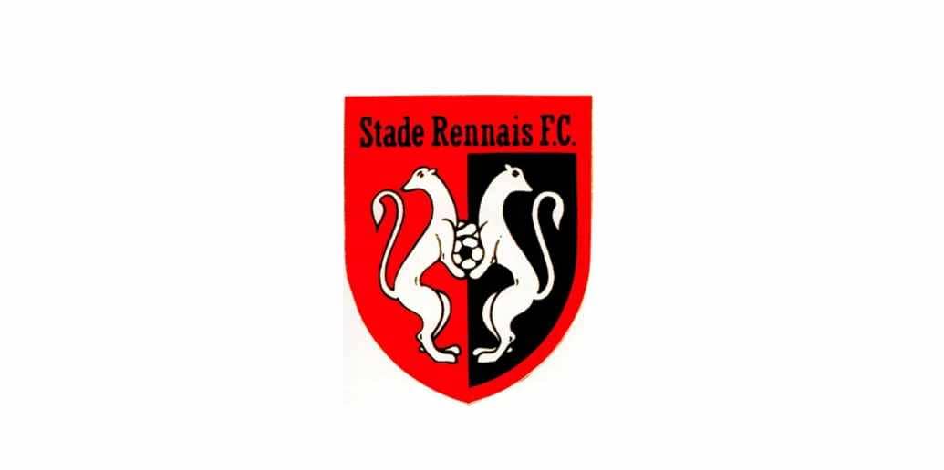
1972 — 1994
The Rennais logo from 1972 features a sleek shield, vertically divided into two equal parts, where the left one is red, and the right one — black. The shield and separation lines are gold, which is balanced by a wordmark, placed above the emblem on a black background. The arched “Stade” located above the straight “Rennais” is executed in a clean and simple sans-serif typeface, which looks elegant and luxurious.
On the shield there are two elegant stoats in white color are placed facing each other and holding a gold football.
1994 — 1997
In 1994 the logo was redrawn and simplified, though the main elements remained the same, the gold framing and accents were gone. Now two white stoats were holding a white ball and the wordmark above their heads was placed on a red background and colored black.
The “Stade Rennais FC” inscription was executed in a traditional serif typeface with each word written in a title case.
1997 — 2003

In 1997 the visual identity of the famous French club gets a new shape. The shield is being replaced by a modern and clean octagon, which was also vertically divided into two equal parts — red and black.
The two white stoats and a white football with black and red accents were placed in the middle of the badge.
As for the wordmark, now it was located under the emblem, set in two levels: the bold “Stade Rannais” on top, and thin and delicate “Football Club” at the bottom.
Both parts of the inscription were set in all capitals and executed in a clean and simple sans-serif typeface with a lot of space between the letters.
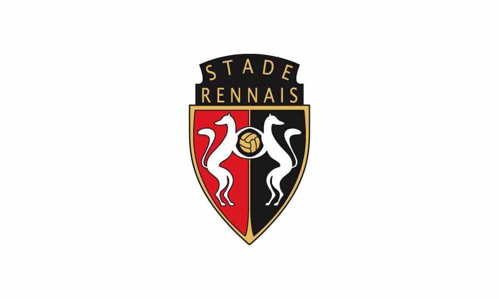
2003 — Today
![]()
The redesign of 2003 brought the new emblem we all know today. It is a mixture of two previous versions, with the octagon placed inside the shield. The left red part of the octagon is placed over the black half of the shield and the black one — over the red.
Football is now a solid white dot, and the contours of the stoats are modified and cleaned.
The white color of the image is balanced by a white wordmark, placed under the oc-tagon, in the bottom part of the shield. It is written in a classy and sophisticated serif typeface with “Stade Rennais” enlarged. The gold “1901”, pointing on the club’s es-tablishment date, is placed under the “Football Club” lettering.


