General Mills is a big food processing company, which was established in 1856 in the United States. There are hundreds of different foods produced under the company’s brands, including dietary supplements enriched with vitamins and minerals.
Meaning and history
General Mills is a legendary American company, which today is the 6th global food group in the world, with a portfolio of more than 100 brands. The company was established in 1866, and throughout the years, it has expanded and changed its fields of activity several times.
In 1866, in St. Anthony Falls, Mississippi, an American entrepreneur, Cadwallader Washburn, built a mill to grind flour. It was a huge mill, which was really successful. In 1887, the company was bought by hereditary businessman John Crosby, and the name was changed to Washburn-Crosby Company. Crosby expanded production to another 26 mills across the country.
The company continued to make flour until the Great Depression. Those were the hard times for the whole country, and lots of businesses haven’t survived them. Washburn-Crosby was on the edge, and its owner even considered selling it, eventually deciding to go public and expand into other food products. For public trading, the company was renamed General Mills. It happened in June of 1928.
During World War II the company began to manufacture food products for the military: cereals, dry rations, and breakfast Cheerioats. And also started working in a completely different field, machinery, opening a special division. After the war, General Mills Mechanical continued to work with the government, producing balloons, telescopes, flight recorders, and even submarines. In 1964, General Mills engineers built the submarine Alvin, which was used to explore the wreck of the Titanic in 1986.
As for the food segment, it was not forgotten. In 1970, the company bought the Red Lobster restaurant chain, which it then expanded into a national chain. In 1980 it also acquired the Good Earth restaurant chain, and then opened a separate division, Darden Restaurants, putting a former Red Lobster manager at its head.In 2000, continuing its expansion, General Mills bought Pillsbury, a company, which started from a mill on the other bank of the river from the Washburn Mill.
In the 2000s General Mills acquired several more food brands, including organic food manufacturer Small Planet Foods, a French yogurt company Yoplait SAS, and a Brazilian company Yoki Alimentos, which produces cereals, flour, tea, and some other products.
Today General Mills owns almost 80 production sites in different countries and produces breakfast cereals, yogurts, ice cream, baking mixes, and flour, as well as pet food.
What is General Mills?
General Mills is the name of an American food company, which was established in the middle of the 19th century. Today it is a globally recognized brand, which produced a variety of foods, including dietary and health supplements, suitable for people with various health conditions.
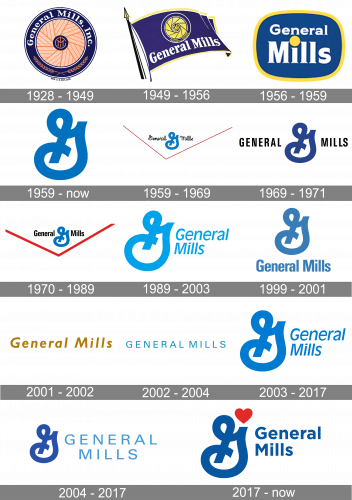
1928 – 1949
The original GM logo was a blue ring with some orange wheat ears arranged into a pattern inside it. In the center, they converged on a smaller circle with the thin, orange ‘G’, ‘M’ & ‘I’ (‘General Mills Inc.) arranged artistically in one space. That full name was also written in blue on the top section of the outer blue ring.
1949 – 1956
The 1949 design was an illustration of a blue flag with a yellow fringe on a black pole with a yellow tip. The center of the flag was occupied by pretty much the previous emblem, except simplified and with yellow instead of orange. The full name was almost unchanged and placed in the lower part of the banner.
1956 – 1959
The following logo was simpler – just a blue rectangle with rounded corners and a yellow frame, holding the company’s wordmark. The latter uses bold serif letters written in white with an overly large yellow dot above ‘i’.
1959 – Today

In 1959, they introduced the emblem they kept using in many variations ever since. It’s a blue letter ‘G’, except written by hand and in an unorthodox position (mirrored and with a lot of twirls).
1959 – 1969
This logo uses their main emblem with the words ‘General’ & ‘Mills’ written on its either side. They use the same hand-written, strange letters, but colored black. There are also two red lines converging into an angle below.
1969 – 1971

The 1969 design uses the idea from the previous logo, minus the red part. For this one, they changed the font of the words into a comprehensible, black sans-serif.
1970 – 1989
A similar design was used here, except they started using lowercase letters alongside capital ones and reintroduced the red structure, but with bolder lines.
1989 – 2003
This logo uses a slightly softer, turquoise emblem. The name wordmark of the same color was written to its right in two lines, using a slimmer sans-serif style.
1999 – 2001
The secondary 1999 logo uses the words and the emblem from the 1970 design, yet completely blue. Here, the words are bigger and put below the sign.
2001 – 2002

In 2001, they tried using just the name – this one is using the tilted, orange letters with a sans-serif font.
2002 – 2004
In 2002, they shifted to the slimmer, fully capital letters. These are upright and use the usual blue color.
2003 – 2017
In 2003, they basically returned to one of the older designs (the 1989 one) with a darker blue shade and minor changes.
2004 – 2017
The additional 2004 logo uses a combination of the usual emblem and the wordmark from the 2002-2004 design put on its right in two lines.
2017 – Today
The visual identity of the famous company is pretty well recognizable across the globe and evokes a sense of protection and reliability. Its curved emblem in blue and red symbolizes love and care and shows the customers’ health as the main value of the American brand.
The General Mills logo is elegant and simple, it looks like a celebration of traditions and heritage, yet is still pretty modern and confident. The logo is composed of two parts — a strict straight logotype, which is usually set in two levels, but sometimes is complemented by a tagline, and an iconic emblem, which is located on the left of the inscription, but can also be seen on its own, as the company’s icon.
The nameplate in a title case is executed in a bold and modern stencil sans-serif typeface, which is very similar to Geo Deco Heavy and Oblivian Text Extra Bold fonts, with their thick and clean lines. When the “Making Food People Love” tagline is used with the logo, it is always written in the same typeface, but in smaller letters. This makes the logotype balanced and solid.
The iconic emblem of the bran is composed of a curved stylized letter “G” executed in royal blue color with a small red heart above it. A symbol of love and caress, of attention to health and well-being, the emblem evokes a sense of safety and responsibility.
The blue and red color palette of the logo, which is usually placed on a white back-ground is a representation of the company’s professionalism and loyalty, along with their passion for what they do and love to their customers.
Font and Color
The bold and stable title case lettering from the primary badge of General Mills is set in a heavy sans-serif typeface with clean contours of the massive characters. The closest font to the one, used in this insignia, is, probably, Avenir Pro 95 Black, or Acherus Feral Black.
As for the color palette of the General Mills visual identity, it is based on a confident and intense combination of blue and red, with all elements set against a white background, making up the most popular tricolor scheme — blue, red and white, a symbol of professionalism, nobility, freedom, and trustworthiness.


