GameStop Corp. is a Texas-based company specializing in selling video games, consumer electronics, and gaming merchandise. At some points in its history, it was a Fortune 500 company and climbed at the 464th line of the list, but as of the summer of 2021, its position is lower (521st).
Meaning and history

The GameStop logo exploits the “warning sign” theme alluding to it in several ways.
What is GameStop
GameStop, which describes itself as “a digital-first omnichannel retailer,” sells an impressive range of games and entertainment products in over four thousand outlets. While the company is headquartered in Grapevine, Texas, US, its outlets can be found in ten countries.
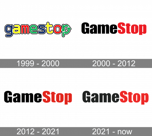
1999 – 2000
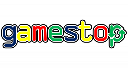
The original version was by far more colorful and playful than the following one. While it featured nothing but the name of the brand, each letter had a different color, which created that lively and youthful spirit.
The colors were rather bright, except for the dark blue “s” and “g,” which added some depth and contrast. The letters had a white and black trim, which also contributed to the depth of the design.
The combination of colors created a certain rhythm. Both the words in the name of the brand had four letters, and each of the words featured the same sequence of colors (dark blue, yellow, red, and green). This is what helped to connect the two parts with each other and make them parts of a single whole.
The most unique glyph is the final “p.” Its top is formed by two arrows with curved stems. The result is a dynamic touch. Also, the circular motion may be interpreted as the symbol of the range of products provided by the brand.
2000 – 2012
The updated design appears to do a better job. It is more eye-catching and easier to grasp. It doesn’t look childish anymore due to the more classic shapes of the glyphs as well as the updated palette.
This time, only two colors were left in the basic version of the GameStop logo: the first four letters are black, while the second four letters are red. This puts the emphasis on the word “stop.” We should bear in mind that, in addition to being just a part of the name, this word is also a command. When set in red, it becomes more accentuated – compare the way red is used in road signs, for instance. So, if this logo could speak, it would say: “Give up what you’re doing and do stop here.”
In addition to the wordmark, the logo often features the “power to the players” tagline. In the 2000 version, the tagline was set in a lowercase sans which looked rather stout. The following version showcased an all-caps sans that had classic rectangular proportions (the height of the glyphs exceeded their width).
We can’t but mention a slightly different version that is used on the brand’s website. Here, the name of the company is all-red. One of the reasons might be the fact that, when the user is already on the website, there is no need to say “Stop” to him, like when he is just walking past a retail outlet. Also, using a single color makes the design more minimalist – it looks like a single whole in this way.
Additionally, there is a yellow version, which can be seen on some signs. The type is the same, but there are black shades, which add some depth to the otherwise flat design.
2012 – 2021
The redesign of 2012 has kept the composition of the previous badge, slightly cleaning the contours of the heavy characters and reopening its color palette, getting a more intense shade of red, which looked more passionate and powerful than the one, one the logo from the beginning of the 2000s.
2021 – Today
In 2021 the GameStop logo got another refinement of the color palette, with the dark red replaced by its scarlet shade, a more vivid and dynamic one, with the new mood brought to the logo.
Colors and font
While the primary GameStop logo combines black and red in almost equal proportions, there are also other variations described above. The choice of red seems natural, as it is part of the “warning sign” subliminal message, which is key for this brand.
The clean sans serif typeface also makes it somewhat similar to road signs or other warning signs, while the fact that the type is bold gives more weight to the warning.


