Freddie Mac, which is the colloquial name for the Federal Home Loan Mortgage Corporation, is a public government-sponsored enterprise created to support the housing finance system in the US. It buys loans from approved lenders and pools them into securities sold to investors in different corners of the globe.
Meaning and history
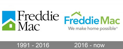
The evolution of the Freddie Mac logo reflects the evolution of our conception of what is a successful logo design. While the older version already worked well, the new one looks more up-to-date.
What is Freddie Mac
Freddie Mac (FHLMC) was created by Congress in 1970 to help ensure a reliable and affordable supply of mortgage funds across the US. It works in the secondary market for mortgages and is headquartered in Tysons Corner, Virginia.
1991 – 2016
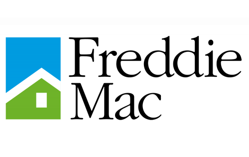
The previous logo could be easily broken down into two parts that didn’t merge together very well. On the left-hand side, there was a stylized house. To be precise, there was a white roof over a light green wall with a white window. The clear light blue sky above added a peaceful touch. The symbolism behind the emblem was transparent – the house perfectly reflected the company’s slogan “We make home possible.”
The wordmark, which was placed to the right of the emblem, featured a serif type combining thick and thin lines. The type looked refined and elegant, but it also appeared somewhat old-fashioned despite the playful curves on the “d’s” and the “a.”
Then again, the “old-fashioned” font could have been used to connote tradition and heritage. It was a way to remind us that Freddie Mac, which was established in 1970, is proud of its history.
Eventually, though, the company got rid of the serif type replacing it with a more up-to-date font.
2016 – present
When you compare this version to the previous Freddie Mac logo, you can see that the former manages to convey the same message using fewer symbols. The updated logo is by far more compact and sleek, but it doesn’t lose any of its meaning. Vice versa, we can now notice new symbolic details.
The house emblem was reduced to a green roof. The small chimney, which hasn’t been present in the old logo, becomes a meaningful detail. It makes us imagine the warmth of the fire burning in a cozy room. The roof is placed right above the word “Freddie” in such a way that it conveys protection and security.
The wordmark now features a minimalist sans. Interestingly, the first word is light blue, while the second word is green. In this way, the designers who worked on the logo created a visual border between the two parts of the name. This move also let them preserve the original color scheme.
Colors and font
The light and vivid colors of the palette contribute to a tranquil, careless mood. These are the colors of the countryside or the colors one can see when he or she is standing at the porch of a house purchased with the help of Freddie Mac. In other words, the palette conveys the brand’s promise.
The type in the Freddie Mac logo is simple and unpretentious, yet it does its job perfectly well.


