Akbank T.A.Ş. is a Turkish bank, which was ranked as the 126th most valuable banking brand by Bankdirectory. Akbank was established in 1948.
Meaning and history
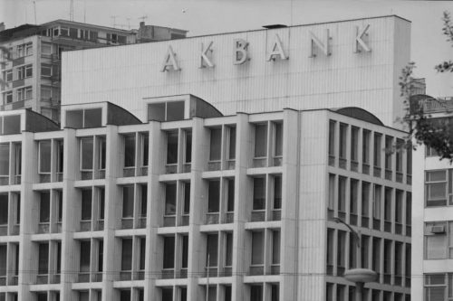
In spite of its long history, the company has preserved the core of its visual brand identity almost intact. Even a 1950s photo of the office of Istanbul showcases a sign looking pretty much like the current Akbank logo.
What is Akbank
One of Turkey’s best-known banks, Akbank is headquartered in Istanbul. Its largest shareholders are members of the Sabancı family. In 2018, it was named the country’s most valuable banking brand in “Brand Finance – Banking 500, 2018” report.
Old logo
In the photo mentioned above, the sign at the top of the building contains nothing but the name of the company in huge sans serif glyphs. The glyphs have classic shapes – they look pretty much like the letters from a school textbook from where kids learn the names and shapes of the letters. Such a type might be interpreted as generic but we should bear in mind that this is a bank, not a rock band, so there is a need for a “safe,” “secure,” and “stable” logo. In other words, here, such an approach appears more than appropriate.
The photo is black-and-white, so we cannot draw any conclusions about the color of the wordmark. However, the overall structure and style of the design have remained unchanged, and even if the color had been different, we cannot deny this fact.
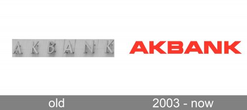
That said, we can mention that the proportions of the letters were slightly different, as was their weight.
2003 – Present
If you compare the old Akbank logo with the following one, you will see that the latter does a better job in conveying such notions as stability and security. One of the easiest ways of representing these qualities visually in a typeface has always been the bold weight and square proportions.
Icon
Whatever the advantages of a wordmark logo, its drawbacks become obvious when it comes to creating an app icon or a favicon.
Companies that have a recognizable pictorial emblem immediately associated with the brand can use this emblem for an app icon without sacrificing recognizability (think Whatsapp or Chrome).
For a company with a wordmark logo, you have to come up with something else. There are several ways of resolving the conflict between the long wordmark, which suggests a rectangular box, and the need for a square icon (it is the square, not the rectangle that is the basic shape for app icons and favicons).
Some brands are lucky to have a very short name that can be squeezed into a square without any visual problems. Others are even luckier to be so well-known that even the truncated wordmark is already recognizable (think Google).
Yet, for the vast majority, creating the right icon is one of the worst design challenges. How has Akbank resolved this problem?
In fact, they found two solutions, which also means they have at least two versions of an icon.
For the website icon on the Turkish version of their site, they used the capital “A” inside a red box. This is because in Turkey the bank is popular enough.
For the app icon and the global favicon, they truncated the logo leaving only the central part. This is an unusual solution, and it still leaves large free spaces above and below the wordmark. To make things worse, when it comes to the favicon on the global website, the name of the bank isn’t even legible.
Colors and font
For the bank’s clients, the stout type sends a subliminal message that their money is safe. This means that, while the designers haven’t invented the wheel here, they created an efficient visual brand identity that serves its purpose perfectly. Moreover, the Akbank logo is eye-catching due to the choice of color, a bright shade of red.


