Foreign Policy is an American news magazine, focused on international and domestic policy. It was first issued in 1970 and now it produces mostly digital content, with only 6 printed issues per year.
Meaning and history
Foreign Policy is an American magazine headquartered in Washington DC and published by The Washington Post. The magazine, founded in 1970, was originally published once a quarter, but now comes out every two months. Even though the Foreign Policy publication is only released in the United States, the magazine is very popular worldwide, especially for its list of a hundred global thinkers, The FP Top 100 Global Thinkers, published every year.
The magazine was founded in 1970 by Samuel Huntington, an American political scientist and author of the “clash of civilizations” concept, and Warren Manchel, an American diplomat, and investor, with the support of the Carnegie Endowment. Over the years, it has won numerous awards for journalism, including National Magazine Awards in 2003, 2007, and 2009.
What is Foreign Policy?
Foreign Policy is the name of an American news magazine, which was established at the beginning of the 1970s, and by today has grown into one of the most reputable political publications in the country, with a circulation of more than 35 thousand magazines.
1970 – 2014
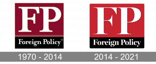
The original Foreign Policy logo, designed in 1970, stayed with the magazine for fourth four years without any changes. It was a solid square in burgundy and black, with the softened bold “FP” abbreviation written against the top burgundy part of the badge in a heavy and stable serif font, and the sharped and more elegant “Foreign Policy” placed on the bottom of the logo, against a solid black rectangular, which was separated from the burgundy part by three thin yellow horizontal stripes.
2014 – 2021
The redesign of 2014 has refined the contours of all the Foreign Policy logo elements, and brightened up the color palette of the badge, turning burgundy into red, and removing the yellow accents from the composition. The new logo looks cleaner and sharper than the previous version, with a strong color contrast creating a more powerful and sleek look of the whole image.
The Foreign Policy logo is an abbreviation of the brands name, “FP”, executed in classic serif font. It’s color palette is very common for the media industry – red background and white lettering.
The logo form is a square which makes it look good as an icon in mobile applications and website. And it makes a lot of sense, as the magazine produces its content mainly on the Internet.
Everything in the Foreign Policy logo is strict and clear, reflecting the writing style and the topics the magazine is focused on.
Font and Color
The old-style stable bold lettering from the primary Foreign Policy logo is set in a heavy traditional serif typeface with the title case characters looking confident and professional. The closest fonts to the one, used in this insignia, are, probably, Tabac G1 Bold, or Kepler Bold Semicondensed Display, but with some minor modifications of the characters.
As for the color palette of the Foreign Policy visual identity, it is based on powerful traditional colors: black, red, and white, which represent professionalism and expertise, pointing to the reliability and confidence of the American editorial, and evoking such senses as responsibility, strength, and excellence.


