Castorama is a French private retailer company specialized in trading do-it-yourself items, home improvement instruments and materials as well as gardening products. It was founded by French entrepreneur Christian Dubois in 1969 in Lille, France. In the eighties, the company was rapidly developing and, in the nineties started expanding across the borders, having opened its first hypermarket in Italy. In 1998 – 2002, the British multinational retailing group Kingfisher plc acquired Castorama, which continues to operate under its previous name but within the Kingfisher group.
Meaning and history
Founded by Christian Dubois in France in 1969, Castorama has evolved into one of the leading retailers in the European home improvement market. Over the years, the company has expanded its operations, establishing a strong presence in countries like Poland, Russia, and Italy. Castorama’s commitment to providing quality products and excellent customer service has been central to its success.
With a focus on innovation and adapting to changing consumer needs, Castorama has introduced various initiatives to enhance the shopping experience. This includes the development of online platforms to cater to the growing demand for e-commerce solutions in the home improvement sector. Furthermore, the company has invested in sustainability initiatives, promoting eco-friendly products and practices across its stores.
Currently, Castorama continues to be a prominent player in the home improvement industry, offering a diverse range of products and services to customers across Europe. Through strategic partnerships, continuous expansion, and a commitment to customer satisfaction, Castorama remains at the forefront of the retail landscape, poised for further growth and success.
What is Castorama?
It’s a renowned company specializing in home improvement products and services. Offering a wide array of DIY solutions, tools, decor items, and gardening supplies, Castorama caters to the needs of homeowners and professionals alike. With its strong presence in Europe and a commitment to quality and innovation, Castorama stands as a trusted destination for individuals seeking to enhance their living spaces.
1969 – 2006
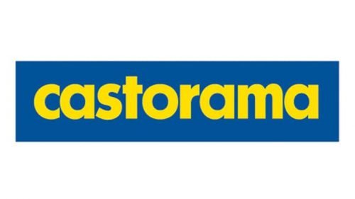
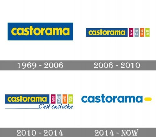
The initial Castorama logo was created in 1969 and featured a simple yet stable and bright combination of a yellow lowercase logotype placed on a calm blue rectangular background. The inscription was executed in a traditional bold sans-serif the page and looked friendly and confident, showing the character of the company and evoking a sense of reliability and trustworthiness.
2006 – 2010
With the redesign of 2006, the visual identity of Castorama got some additions. First of all, the main logotype was slightly refined and cleaned. Secondly, to the right from the blue rectangular, there were added four smaller narrow ones, each in its color — dark pink, gray, orange, and lime-green. On every figure, there was white lettering with one of the departments of the retailer.
2010 – 2014
In 2010 another thing was added to a clean geometric Castorama logo. Now it was accompanied by a smooth cursive “C’est Castoche” tagline, written in the same blue shade as the main rectangle, and having a thin long horizontal line coming out of the first letter and stretching to the left.
2014 – Today
The logo of Castorama consists of the company’s name written in block letters. The graphics of the letters are rounded and reader-friendly, very close to the font Neometric Alt Extra Bold. Initially, the wordmark was made in bumblebee yellow colour on a cobalt blue rectangular background.
As explained by Castorama web site, the yellow colour refers to the sunlight, it is associated with the feelings of optimism and hope, while the blue tone of the logo is linked to the freshness of the sea and the sky, referring to the sense of confidence, security and the order.
Lately, the logo was modified. It is still the name of the company, but this time it is written in block letters of a dark tone of cerulean blue colour against a white background. The yellow colour is preserved in the logo by placing a bumblebee yellow oval next to the wordmark. There is also another version with white letters on a blue background. Sometime the logo may be on a black rectangular background with blue letters of the brand name; in this case, both the wordmark and the yellow oval have a thin white border.
For many partners and clients of Castorama, its logo is associated with the company’s declared mission, which is to make its customers stronger and give them a broader choice of possibilities through a large assortment of items and constantly lower prices. The company’s undertaking is to work for those who make repairs in their home or garden.


