FoodPanda is the name of an online food delivery service, which was established in 2012 in Germany. Today the application, which is fun and easy to use, is available in more than 50 countries across the globe and provides its customers with a rich choice of options to order and enjoy.
Meaning and history
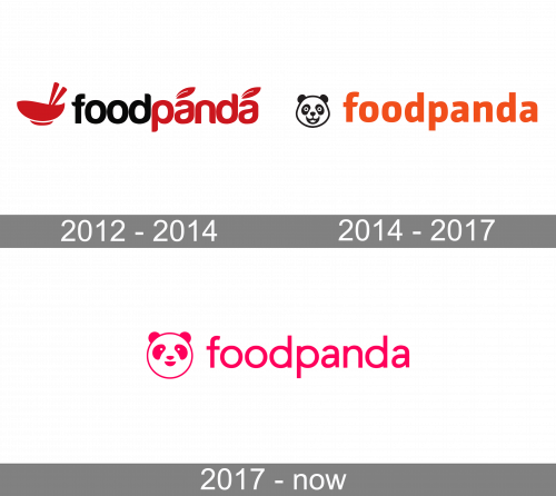
The FoodPanda visual identity was first introduced in 2012, and only redesigned once, five years later, though the changes have done can’t be called a complete redesign,?85 was more about the brightness and color palette, but in the new execution, the simple and clean image started looking differently.
What is FoodPanda?
FoodPanda is a European mobile application, offering food delivery services to people in more than 50 countries. The service was developed in 2012 in Germany, and today is pretty popular not only on its continents, but worldwide.
2012 – 2014
The original FoodPanda logo, introduced in 2012, featured a combination of an emblem and a bold lowercase lettering, executed in a black and dark-red color palette. The emblem depicted an Asian food bowl with two chopsticks sticking out on it to the right, while the logotype had two stylized red leaves placed diagonally above two letters “A”, which also added an Asian fleur to the badge.
2014 – 2017
The original FoodPanda logo, created for the delivery application in 2012 was composed of two parts, set one above another. The upper part was taken by the graphical element, which was a monochrome Panda head drawing. The animal was smiling and looked super friendly and welcoming. The emblem was placed above lowercase lettering in orange, featuring bold smooth lines and adding some energy and style to the simple composition. The inscription looked modern and bold, and evokes a sense of professionalism and progressiveness of the brand, making the customers trust.
2017 – Today
In 2017 the FoodPanda logo was redesigned. Though the style remained the same and the logo is still composed of the Panda portrait set above the lowercase lettering, it looks fresher and more modern than the previous version. The lines of the graphical part were modified and became thinner, though haven’t lost their confidence. The face of the animal is now formed by a perfect circle, while the eyes and smile are less detailed than on the logo from 2012.
As for the inscription, its typeface was simplified, but it didn’t simplify the logo, on the contrary, the clean modest lines of the lowercase lettering made it all look cooler and created a special futuristic look adding a sense of your spirit to the logo.
And, of course, the main change of 2016 was the color palette. The combination of black and orange on a white background got replaced by a fuchsia-pink, a color of life, passion, and energy, which brilliantly represents the aims and values of the German company, which is constantly growing and expanding.
Font and Color
The clean medium-weight inscription from the primary FoodPanda logo is set in a modern full-shaped sans-serif font, with all lowercase characters looking stable and distinctive. The closest fonts to the one, used in this insignia, are, probably, Biotif Medium, or Atyp BL Text Medium, with some minor modifications.
As for the color palette of the FoodPanda visual identity, it is set in fuchsia pink, a bright and lively color, which makes the logo of the service stand out in the list of its competitors, and represents the company as a friendly and caring one.


