Fnac is a retail chain offering a variety of cultural and electronic products, from music and books to TV.
Meaning and history
The company was established in 1954 as Fédération Nationale D’achats. Later, the name was replaced by Fédération Nationale D’achats des cadres (meaning “National Purchasing Federation for Cadres” in translation from French).
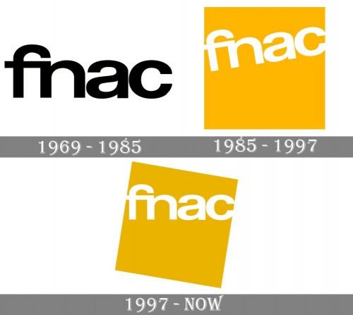
Over the last half a century, the Fnac logo has used the same typography. The palette and additional pictorial elements have varied.
1969
One of the oldest logos already featured the now-familiar wordmark in rounded lowercase letters. The letters belonged to an unpretentious sans and looked pretty generic, except for the “f” and “n” combination. The link between the two letters added a unique touch making the logo easily recognizable and memorable.
On the downside, the wordmark wasn’t very eye-catching.
1985
The addition of the orange square on the background made the emblem brighter, easier to spot. The black letters were replaced by white ones. As a result, the emblem grew more joyful and youthful.
To strengthen this effect, the designers decided to position the lettering in a different way: the horizontal line was replaced by the diagonal one. Parts of the “f” and “c” were cut off (it looked as if they didn’t fit into the box). This also added a laid-back, casual touch.
1997
A couple of slight modifications made the design slightly more refined.
The most notable modification was the color – the generic yellowy-orange was replaced by a rarer, and thus, interesting tint. The name of the company was straightened and positioned strictly horizontally.
Yet, the casual youthful touch was preserved by rotating the box, which now stood on one of its angles.


