FlixBus stands out in the transportation industry as a pioneer in offering cost-effective and environmentally conscious bus services. Predominantly active in Europe and extending its network to the U.S., FlixBus connects major urban centers while championing green initiatives. Owned by FlixMobility, a German entity, its ownership includes notable investors like General Atlantic and Silver Lake, along with Permira. FlixBus distinguishes itself by merging digital innovation with travel comfort, catering to a budget-conscious clientele. This approach has enabled the company to expand rapidly, making intercity bus travel not just more accessible, but also a more sustainable choice for consumers. Their commitment to eco-friendly practices aligns with global trends towards greener transportation methods, positioning FlixBus at the forefront of an evolving market.
Meaning and history
FlixBus was established in 2013 by three ambitious entrepreneurs, Jochen Engert, Daniel Krauss, and André Schwämmlein. The company emerged in Munich, Germany, and quickly became a disruptor in the European long-distance bus travel market. Its unique business model, which combines technology, e-commerce, and traditional transportation, enabled rapid expansion and popularity among travelers seeking affordable and convenient options.
Notably, FlixBus achieved significant milestones, such as expanding its services across Europe and entering the U.S. market in 2018. The company’s commitment to sustainability is evident in its operations, including the introduction of the first electric long-distance bus routes in France and Germany. Another remarkable achievement was the integration of train services in 2018, further diversifying its transportation offerings.
Currently, FlixBus stands as a leading figure in the eco-friendly travel industry. It continues to innovate, focusing on digitalization, customer experience, and sustainable solutions. The company’s vast network connects millions of passengers to various destinations, cementing its position as a key player in the international transportation sector. With ongoing plans for expansion and improvement, FlixBus remains at the forefront of transforming the future of bus travel.
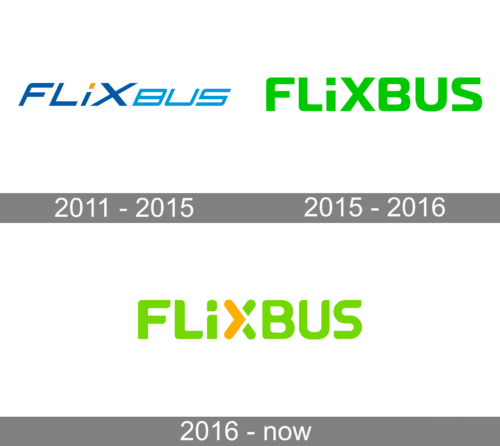
2011 – 2015
The logo of FlixBus, characterized by a clean, modern sans-serif font that conveys a sense of sleekness and efficiency. The company’s name is spelled out in uppercase letters, predominantly in a deep, royal blue that suggests reliability and professionalism. The letter ‘I’ stands out with its dot replaced by a bright orange square, possibly representing innovation and a spark of creativity in the company’s approach to travel.
2015 – 2016
The visual emblem for FlixBus is a bold statement in luminescent chartreuse, a shade that echoes the brand’s dedication to eco-conscious travel. The logo’s characters are designed in a contemporary, sans-serif font that communicates the brand’s commitment to modern, efficient service. The separation between the letters conveys a sense of order and simplicity, symbolic of the company’s straightforward approach to customer service.
This unembellished design, devoid of any icons or complex features, underscores the brand’s pledge to provide transparent and direct transportation solutions. The chosen hue of green not only reinforces the brand’s environmental ethos but also stands out in the visual landscape, signaling the company’s innovative spirit in the competitive travel industry. The logo encapsulates the essence of FlixBus’s mission: to deliver travel experiences that are as kind to the planet as they are to the traveler’s needs.
2016 – Today
The logo presents the brand name “FLIXBUS” in a bold, modern sans-serif typeface. The letters are rendered in a bright, lime green color, symbolizing growth, freshness, and environmental friendliness — attributes closely associated with the company’s sustainable travel philosophy. Unique to the logo is the incorporation of an orange “X” that stands out against the green, adding a dynamic contrast and perhaps subtly symbolizing the intersection of technology and travel which the brand prides itself on. The “X” could also be interpreted as a representation of connectivity, reflecting the company’s extensive network of bus routes across various destinations.
The logo’s simplicity and use of vibrant colors not only ensure high visibility and brand recall but also convey the brand’s commitment to providing a straightforward, reliable, and eco-friendly travel experience. The overall design is clean and uncluttered, with no additional embellishments, emphasizing the brand’s focus on efficiency and modernity.


