Over its more than 370-year history, Fiskars has gone through various logotypes. One of the recurrent themes has been the crown, which has become a prototype for the current logo.
Meaning and history
The primary Fiskars logo is totally different from that of the Fiskars Group logo.
The brand’s logo represents its name given in an austere sans serif type. The type is rather light. What makes it somewhat unusual is that the letters are placed very close to each other. In the case of the “A” and “K,” they even stick together.
Another distinctive touch is the orange color inspired by one of the company’s best-known products, the orange-handled scissors introduced in 1967.
What is Fiskars?
Fiskars is the name of a Finnish company, which was established in the middle of the 17th century and is specialized in the production of gardening tools, scissors, knives, and various ceramics products. The company is considered to be the oldest operating business in its country.
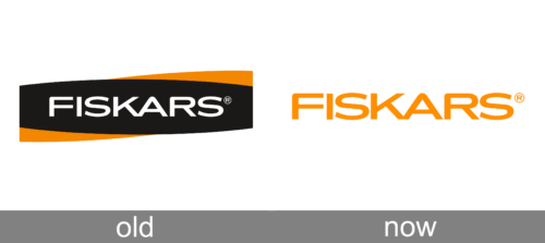
Old
The old Fiskars logo featured a geometric and bright horizontally oriented banner in black and orange with the colorful smooth elements delicately placed in the top right and bottom left parts of the badge, adding softness and unique shape to the composition. The main part of the banner was taken by a bold uppercase logotype in white, executed in a modern softened sans-serif typeface.
Today
After the redesign, the Fiskars badge has kept its modern and recognizable typeface, but simplified the composition, leaving the inscription on a transparent background as the only element. The uppercase logotype can be seen in two color options: medium-gray or orange, which both look very stylish and professional.
Fiskars Group emblem
The list of logotypes the company has used includes the “FB” monogram inside an oval and the “FA” monogram without the oval, a double “O” (with and without a crown), an “F” topped with a curl and a crowned “F.” It is the latter that has been used as a source of inspiration for the current version.
The historic logo featured the “F” and a crown with three points. The designers have lifted the central point and lowered the other two. Below, they added a mirror reflection. The result was a shape that could be described as something in between a square and a four-pointed star. To introduce some dynamism, a white circle was added to the center.
As the company explained in a press release, the icon symbolizes “the everyday extraordinary,” which reflects the band’s mission “Making the everyday extraordinary.”
The star on the Fiskars logo is colored neon green and placed between the words “Fiskars” and “Group.”
Company overview
Fiskars Group is based in Helsinki, Finland. Founded in 1649, it is the oldest business still operating in Finland.
The range of products the company produced has varied a lot. Today, it sells products for home, garden, outdoor activities, interior decoration, and table setting. The group owns several brands, from Fiskars to Iittala, Royal Copenhagen, and Waterford.
Font and color
The bold uppercase logotype from the primary badge of the Finnish colony Fiskars is set in a progressive and sleek sans-serif typeface with medium-thick lines, softened angles, and stable shapes of the characters. The closest fonts to the one, used in this insignia, are, probably Lucidity Expand, Laguna Vintage Expand, or Ronsard Crystal Bold, but with some lines modified.
As for the color palette of the Fiskars visual identity, it has two options: a calm and confident gray on white, which evokes a sense of security and expertise; and the bright and energetic orange on white, which looks progressive, fresh, and innovative.


