Weight Watchers is the name of an American company, which was established in 1963 with the idea to help people lose weight. The company offers various services, including dieting, fitness, and mindfulness programs, which today are available through the mobile application.
Meaning and history
Weight Watchers was founded by Jean Nidetch in 1963 and went public in 1968. By that time the WW already had a very good reputation, as an expert in weight loss, and an army of grateful customers. In 1978 the company was acquired by Heinz for 71 million USD. Heinz sell Weight Watchers to European investors at the end of the 1990s, and Weight Watchers go public again in 2001. In 2018, the company shifted its focus from weight to health, renaming it WW International, Inc. with the tagline “Health That Works”.
Pretty intense history was accompanied by an equally intense change in weight loss programs and constant improvement in techniques. The popularity of Weight Watchers in the market was brought to the market by its “Lose weight together” movement, which unites those who want to get rid of excess weight at weekly meetings. Actually, Weight Watchers was the first company to use this simple trick and unite people sharing the same problem to motivate each other.
The main idea of the WW program is that it assigns points to foods and exercises and requires a daily count of points. So you download the app, count the points and lose weight with the support of others like you. This is the scheme proposed by the creators of the popular Weight Watchers diet.
Today Weight Watchers operates in more than 30 countries across the USA, Canada, UK, and Europe, and promotes its products both independently through its network of companies and by the franchise.
What is Weight Watchers?
Weight Watchers, or WW, is an American company, encouraging people in losing weight with their dieting and fitness programs. The company was established by Jean Nidetch in 1963, and today it operates in more than 30 countries across the globe, helping millions of people.
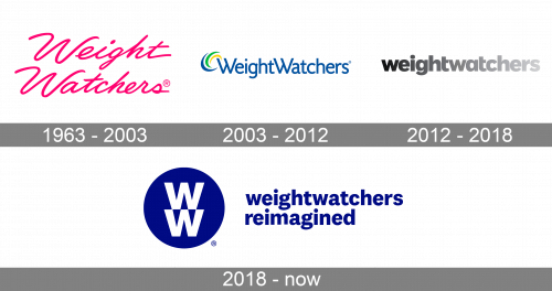
In terms of visual identity, Weight Watchers always liked experiments. Although the first badge of the brand stayed with it for almost fourth years, it was followed by two major redesigns, with a complete change of style and mood.
1963 – 2003
The initial Weight Watchers logo was also the most long-lasting of all, designed for the company throughout the years. It was a feminine fuchsia-pink cursive lettering set in two levels. The custom typeface of the logotype features elongated smooth lines and delicate shapes of the letters. The bright pink color evoked a sense of passion and love, showing the company’s attitude to its customers.
2003 – 2012
The redesign of 2003 was held after the company went public in Europe. The new badge of Weight Watchers was completely different from the original girly version. The new concept included an abstract geometric emblem, with a three-line swoosh in blue, green, and yellow, set on the left from the blue Title case lettering in a modern sans-serif typeface. The new badge looked more professional and clean, although was lacking the warmth and uniqueness the first logo had.
2012 – 2018
In 2012 the Weight Watchers logo was redesigned again, and now it was a bold and brutal lowercase inscription in an extra-bold geometric sans-serif typeface, with two parts of the company’s name set in one line with no space between. The black-to-light-gray gradient color palette made the logotype look unique and extremely stylish.
2018 – Today
In 2018 the Weight Watchers company changed its name to WW International, so the logo had to be redesigned again. The new concept is built around a simple yet bold emblem with a solid blue circle and two massive white letters “W” set one above another. This minimalistic approach, Weight colors, bold lines, and the resemblance to the Volkswagen badge create a new image for the company: confident, reliable, and experienced.


