

![]() PJ Masks Logo PNG
PJ Masks Logo PNG
PJ Masks is an American-French animated series based on the Les Pyjamasques series of books by French author Romuald Rachollo. The series about superhero children started on American television in 2015, and today is familiar to kids and their parents from all over the world.
Meaning and history
![]()
The main characters of PJ Masks are three kids – Amaya, Connor, and Greg, who are only 6 years old. During the day, they are just ordinary kids. But when night comes and it’s time to go to bed, they are transformed. Putting on their pajamas and activating their animal amulets, they turn into superheroes, whom the night dwellers know as Gekko, Catboy, and Owlette (names derived from animal totems). Their totems are, respectively, a lizard, a cat, and an owl.
The animated series debuted in the U.S. in September 2015 and teaches children about cooperation, teamwork, and friendship. It’s a superhero world without violence, fighting, or fear. The show is for preschool-aged children. Many kids are scared of villains in cartoons, but here there are no villains, the cartoon causes only positive emotions, not scary.
What are PJ Masks?
PJ Masks is the name of a very kind animated series, created for kids of a pre-school age. The plot of the series is based on a story of three 6-year-old friends, who turn into superheroes wearing their pajamas.
In terms of visual identity, PJ Masks are very bright and have colors as the main elements. The logo, designed for the pilot of the show was pretty detailed and ornate, but in years, it became more laconic,
201? (Pilot)
![]()
The Pilot version of the animated series featured a logo, depicting all three heroes in their superhero pajamas. The kids were drawn on a background with a night sky palette, and accompanied by a massive golden lettering in gradients, written at the bottom of the composition.
201? (Unused)
![]()
After the pilot version, a new logo was designed for the franchise, but it has never been used. The badge was quite similar to the one, used by the PJ Masks today, but with the inscription set in a different typeface.
2015 – 2019
![]()
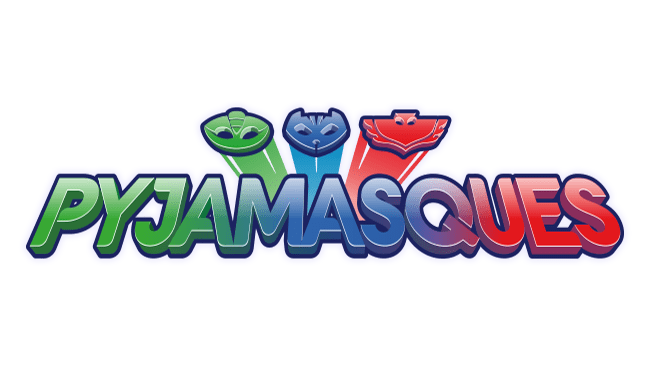
The logo, created for the animated series in 2015, featured a combination of a bold uppercase inscription in green, blue, and red gradients, set on a transparent background and accompanied by three emblems of the totem animals on top. Each animal was drawn in its color — lizard in green, cat in blue, and the owl — in red.
2019 – Today
![]()
After the redesign of 2019, the contours of the logo became thicker and more distinctive, and the vivid tricolor badges gained a double white and black outline and a shadow, which added more volume and brightness to the logo.
Font and color
The bold shadowed lettering from the primary logo of the PJ Masks franchise is set in the uppercase of a custom sans-serif typeface with slightly softened contours of the characters. The closest font to the one, used in this insignia, is probably, Nabana Shadow Bold, but with straighter bars of the letters.
As for the color palette of the PJ Masks visual identity, it is composed of three main shades, green, blue, and red, which correspond to the costumes of kids and their totem animals — the lizard, the cat, and the owl.


