Back to Future is the name of a science-fiction time-travel trilogy describing alternate realities of the fictional town of Hill Valley, California. The first film, produced by Steven Spielberg, was released in 1985.
Meaning and history
Back to Future is the film franchise, composed of three parts, and collectively Tasha rings one name. All three movies are considered to be cinematic classics. The plot of the trilogy is based on the story of time travel and the so-called “butterfly effect,” which causes a lot of problems in the original reality, and the audience has the opportunity to watch with curiosity as the main characters try to correct the situation with the help of a bizarre device.
The film tells the story of a typical eighties American teenager named Marty, who finds himself in 1955 in the time machine invented by his friend, the crazy genius Emmett Brown. The film grossed over $380 million at the box office on a budget of $19 million. Later, the creators released two more films – Back to the Future 2, in 1989, and Back to the Future 3, in 1990. In addition to three movies, there is a series of cartoons, computer games, and comic books, under the same name.
What is Back to Future?
Back to Future is the sci-fi franchise, which started in 1985 with the release of the first movie by Bob Gale. Today the franchise features three movies, a series of comics, cartoons, and video games, and is considered to be one of the world’s most popular science fiction brands ever.
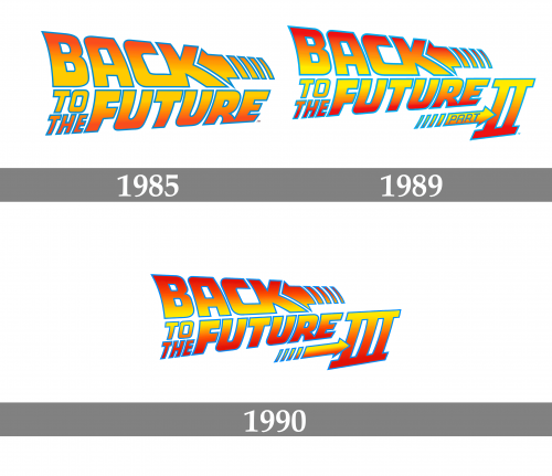
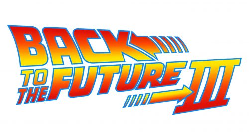
As for the visual identity, the logo of the Back to the Future grand chose hasn’t changed much since the very first film, released in 1985. With each new part the iconic badge was only complemented by the indication of the series — “2” or “3”, and the main elements of the insignia were left untouched.
1985
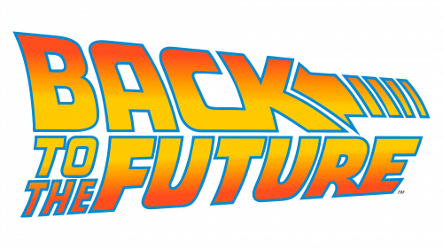
The very first Back to the Future badge was designed in 1985 and featured two-leveled lettering in a custom bold sans-serif. The inscription set in the uppercase was executed in a multicolor gradient; with the bodies of the letters starting from yellow at the bottom and getting orange at the top, and a bright blue outline of each element.
The upper level of the badge had a wide and large arrow pointing to the left placed at the right from the “Back” part of the logotype, repeating the shape and the angle in the letter “K”.
1989
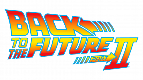
With the release of the Back to the Future 2 film, the new logo was introduced in 1989. The colors of the badge were intensified, with orange getting darker and brighter, and the thinner arrow with the blue “Part” was added to the composition. The new arrow was pointing to the right, on a massive “II”, executed in the same style as all other elements of the badge.
1990
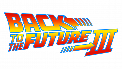
The third part of the trilogy was released in 1990 and had a separate logo. The colors on the badge were even darker than on the previous version, but that was actually the only difference, except for the “II” replaced by the “III” now, to indicate the Back to the Future 3 name of the movie.


