Family Dollar is the name of the American company, established in 1959, and specializes in low-cost retail stores, offering clothing and grocery products along with cleaning supplies and houseware goods. Today the company has more than 8 thousand locations across almost all the states of America.
Meaning and history
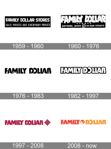
Founded in the 1959s, Family Dollar has always had its visual identity simple yet bold and memorable. Starting the very first version, their logo was text-based and minimalist, but as years passed, the style has become more distinct and the inscription – bright and modern.
What is Family Dollar?
Family Dollar is an American chain of stores, which was established at the end of the 1950s, and by today has grown into a huge company with more than 8 thousand locations across the country.
1959 – 1960
A monochrome logo with the company’s name and slogan “Sale Prices Are Everyday Prices” looked solid yet not too serious. The designer chose to not place all the letters in the name straight but instead overlapped them and tilted slightly either left or right.
1960 – 1976
In the 1960s the company changed the style of the logo. Letters became playful and cartoonish, which looked cool in monochrome. The extra-bold sans-serif symbols were overlapping one another in the upper, “Family Dollar” part of the logo, while the “Stores” used a traditional font and had enough space between the letters.
The original version of the Family Dollar logo was composed of a traditional and strict inscription, set in two independent levels. “Family Dollar” lettering enclosed in a horizontal rectangle, and the “Stores”, drawn in the same font and palette and placed under the first part, also in a rectangular frame, but of a smaller size. The wordmark was well-balanced and looked strong and professional.
1976 – 1983

The new logo looked very stylish and modern thanks to its minimalistic design and font choice. The black strokes were thick and straight with just a few curves. The letters overlapped and had a thin white outline that allowed each letter to stand out. The logo now said only “Family Dollar”.
1982 – 1997
In 1974 the company creates a new design, the one that still can be recognized in today’s logo. The jumping letters from the previous version were now sent in a strictly straight line and gained a new color palette — white with a red outline. Do the word “Stores” is removed, as well as the framing.
1997 – 2008
The new logo looked very stylish and modern thanks to its minimalistic design and font choice. The black strokes were thick and straight with just a few curves. The letters overlapped and had a thin white outline that allowed each letter to stand out. The logo now said only “Family Dollar”.
2008 – Today
The redesign of 2008 modified the color palette by adding a new shade — orange. Another serious change was made to the logo’s graphical part — now it is not just the wordmark, but a wordmark separates by a bold bright circle with an abstract image of a family in it. The symbol is executed in red, orange, and white and evokes a sense of friendliness and love.
Font and color
The bold stylized lettering from the Family Dollar badge is set in a heavy sans-serif typeface with the uppercase letters slightly overlapping each other. The closest fonts to the custom one, used in this insignia, are, probably, Basic Lettering JNL and Retail Price JNL Solid, but with some contours modified.
As for the color palette of the Family Dollar visual identity, it is based on an intense combination of orange and red, two shades, standing for warmth, love, and energy. These hues show the company ‘a approach to business and its main target: making the customers happy.


