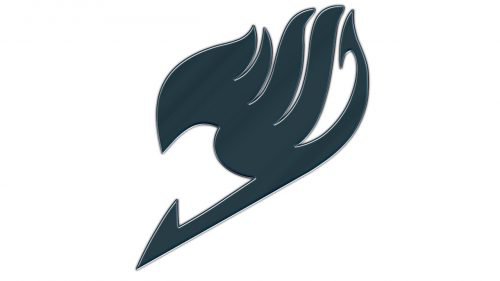
While the Fairy Tail logo may seem somewhat intricate, at first glance, it can be easily broken into two main elements. To begin with, there’s a dragon-like shape on the forefront. It’s placed over the name of the series, which is given in an elaborate “magic” type. As a result, the logo looks pretty cluttered, yet is rich in symbolism and very distinctive.
Meaning and history
The Japanese manga series Fairy Tail was first published in Kodansha’s Weekly Shōnen Magazine in the summer of 2006. The number of volumes reaches 63. The series tells about the adventures of Natsu Dragneel, a member of the wizard guild Fairy Tail. In 2009, an anime series of the same name began broadcasting.
“Fairy” symbol
The orange shape on the forefront is the symbol of one of the guilds described in the series. The Fairy Tail guild is known as the strongest guild in the Kingdom of Fiore.
Each of the guild members makes the same tattoo. At first glance, it may look like a flying dragon or a flying arrow with its tail burning. In the series itself, a different explanation is given, though. Makarov, one of the guild masters, told Lucy that the symbol depicted a dancing or jumping fairy with a tail. Makarov explained that as fairies are mysterious, no one knows whether they do or don’t have a tail. Both the emblem and the name of the guild symbolize that its members are in constant pursuit of mystery and adventure. The picture was made by Mavis, the first guild master.
2006 – Today
The Fairy Tail logo, created in 2006, only features one element — the famous Fairy symbol, which looks like a flame with a pointy arrow on the end of the tail. As we have mentioned above, there may be several interpretations of the emblem’s meaning, and all of them are quite logical and suitable. In the primary logo, the symbol is usually drawn in flat black strokes, against a plain white background, which makes it look strong and very progressive, reflecting the latest minimalistic trends in the visual identity design.
Emblem
The name of the series is given in a very unusual and memorable type. Each of the letters appears to be a picture by itself. The intricate design of the letters goes perfectly well with the “fairy” and “wizard” themes.
Fairy Tail hand sign
In addition to the logo described above, we should also mention the hand sign used by the Fairy Tail guild. To make the sign, you need to keep all the fingers open, except index finger and thumbs. The back of the hand should be facing the audience. The sign was invented by Laxus. Its symbolic meaning can be described in the following way: “Wherever you are, I’ll always be looking at your side.”
Font
The type featured on the Fairy Tail logo is custom artwork. You will probably notice the way it reflects the shape of the Fairy Tail guild emblem on the forefront (for instance, the right end of the “L”).
Colors
The manga version of the emblem features warm and inviting tones: red, yellow, and orange, with only subtle embedding of grey and black.


