FaceTime is the name of an application developed by Apple and presented personally by Steve Jobs in the summer of 2010. The program was created for iPhone 4 and its functionality includes calls with audio and video support between devices.
Meaning and history
Today FaceTime is one of the most popular video communication applications. Not only is it convenient because it has two cameras and the ability to make regular voice calls without video, but it’s also easy to use because it takes a few simple steps to get started and even an inexperienced user can handle the task. There is no need to configure anything, register, and make an account. It is enough to enter the data from your Apple ID. Today there are FaceTime versions for both mobile operating systems and PC, and their logos are slightly different.
iOS
2010 – 2011
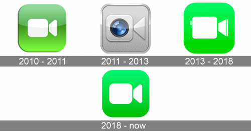
The very first icon for FaceTime on iOS was created in 2010 and stayed as the primary one for only a few months. First seen on iPod Touch, it was a gradient green icon with rounded corners and a white camera image, composed of a softened square and a trapezoid, placed horizontally with its wide side facing to the right.
2011 – 2013
The redesign of 2011 switched the color palette to silver-gray and blue, changing the concept of the icon to be more realistic and voluminous. It was now a square silver emblem in a glossy outline, but with its body matte. The camera in the center of the logo was executed in the same style as the outline of the badge and featured a three-dimensional circular lens in blue and black placed in the center of the plain silver square.
2013 – 2018
The green and white color palette returned to the FaceTime logo in 2013. It was actually the original concept of the badge but in more modern execution. The gradient green square with rounded angles had lighter shades on top, getting slightly darker on the bottom. The white camera image was enlarged and gained some small details: a thin green vertical line on the lens and a small vertically oriented rectangular with softened corners, attached to the upper left part of the camera.
2018 – Today
In 2018 the logo was refined and simplified — the small details were removed from the white camera image, which got its contours modified and softened even more. The symbol also got a hit smaller than on the previous version, and the gradient background — darker, with the gradient almost invisible.
macOS
2011 – 2014
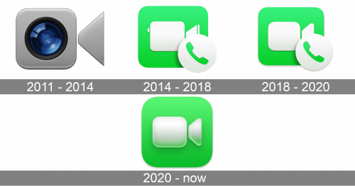
The first FaceTime logo for MacOS was created in 2011, and looked similar to the iOS emblem of those years. A small square silver camera with rounded angles and a sharp enlarged lens on the right, executed in the same shade, a glossy glass blue and black circle in the center, and nothing else. The icon was set on a plain transparent background with no framing.
2014 – 2017
The redesign of 2014 adopted the green and white color palette to the FaceTime MacOS emblem. The white camera on the green background was accompanied by a white overlapping circle with a green handset on the bottom right corner. The gradient of the green square and the shadow of the white circle made the icon voluminous and vivid.
2017 – 2020
The FaceTime logo for MacOS was simplified in 2017 — the details of the camera were gone, and the contours got more minimalist and clean. The green square became smaller, which made the circle with a handset look bigger, and it gained more “weight” in the whole concept of the logo.
2020 – Today
More gradient shades were added to the green and white badge, while the white circle with the green handset was removed in 2020. This is the simplest in its composition but the most modern in its execution logo, created for the application. It looks fresh, modern, and bright is instantly associated with the application and its purpose.


