Iberdrola is the second-largest producer of wind power by revenue and market capitalization. While the company was founded in 1992, its roots can be traced to the beginning of the previous century. It has gone through a long chain of mergers and acquisitions.
Meaning and history
It could have been interesting to compare the current Iberdrola logo to the visual identities of the companies from which it originated, including Hidroeléctrica Ibérica, Saltos del Duero, Hidroeléctrica Española, Iberduero, Saltos del Sil, and Iberduero.
What is Iberdrola?
Iberdrola is an electric utility company serving over 31 million customers. It is headquartered in Bilbao, Spain. The list of notable shareholders has included Qatar Investment Holding, Norges Bank, Kutxabank, and Bankia.
1901 – 1944
The badge of one of the companies, which merged into Iberdrola, Hidtorlectrica Iberica, was designed at the very beginning of the 20th century and featured a pretty simple composition with the arched two/leveled inscription in a bold serif font, placed against a gradient brown background.
1907 – 1944

The logo of Saltos del Duero, another company, responsible for the establishment of Iberdrola, looked extremely stylish and cool. It was a solid black octagon with a stylized white “SD” monogram written over it. Minimalistic and sharp, this badge was very progressive for its times.
1907 – 1991

Hideorlectrica Espanola had a bright geometric badge with a square brutal composition, where the stylized white “HE” monogram was inscribed into a white square frame and placed over a solid red rectangle. Both letters of the monogram shared one vertical bar — the right one in the “H”.
1944 – 1991

The badge of Iberduero, designed in 1944, was very elegant yet pretty simple. It was composed of a title cas inscription in a traditional sans-serif font, accompanied by an abstract emblem, looking like a square oval, crossed by the vertical line, or a Russian letter “Ф”.
1991 – 2001
The original logo of Iberdrola showcased a rather abstract emblem in red and white with the name of the brand in black positioned below.
2001 was a turning point for Iberdrola – the company committed to wind power. To reflect this innovative route, the logo was redrawn from scratch – you can hardly find any similarities between this version and its predecessor, apart from the fact that there is the name of the company.
2001 – 2023
On its corporate website, the company gives a detailed explanation of its logo and the reasons behind the update.
The updated Iberdrola logo features two equally important parts: an emblem and a wordmark.
The emblem combines a green leaf with two drops, one in blue, the other one in orange. The green leaf symbolizes the company’s pursuit of environmentally friendly and clean techniques and approaches. For those who still don’t believe this promise, the company explicitly states on its website that it “cares deeply about the future of the world”.
The second element, the blue drop, can be interpreted in multiple ways: wind power, natural gas, water power. Also, blue, being the color of the water, has a strong connotation with cleanness. So, for the company, it is another way to say that it doesn’t damage the environment.
The orange drop represents renewable solar energy. In a way, it also emphasizes that the company strives to perform its mission with respect to the environment. Also, orange is the color associated with energy and light (not only those that come from the sun). That makes it one of the obvious choices for an energy company.
Iberdrola, though, steers clear of the aggressive style that too much orange might have brought to its logo. Instead, the designers balanced orange with a green wordmark. The shade, which is slightly darker than that of the leaf, looks natural and soothing. It supports the “environmentally friendly” associations brought about by other elements.
Also, such is the shape of the glyphs that they remind green stems. These “natural” connotations don’t interfere with the fact that the type looks modern and highly legible. Looking at this wordmark, we can realize how such values as efficiency and innovation can be reflected in the visual brand identity.
On the whole, the design seems to be efficient. The result came at a cost – in 2020, the company spent $4,788 million on its brand, while in 2021, it spent $5,148 million. This data allowed Interbrand to rank Iberdrola No 6 on the list of the world’s most valuable utilities brand (Utilities 50) both in 2020 and 2021. Also, the company has been listed by Interbrand as one of the Top 10 Spanish companies (Top Best Brands) and a leading brand in the electricity sector.
2023 – now
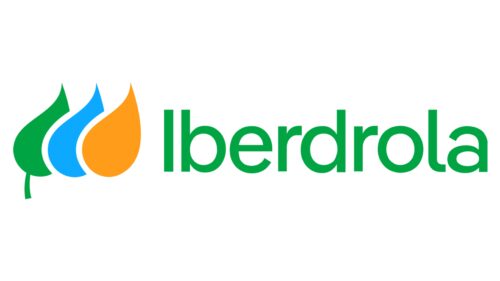
The updated logo is a modern spin on the previous version that preserves the recognizable brand image while reflecting the fact that the company is growing, developing, and keeping up with all the latest technologies. It features the same three leaves, only now done in a solid color without the leaf veins and placed to the left of the name. Although the inscription features a new font, which is similar to Stagnan Medium by ArimaType, the use of the same green color allowed to draw an association with a familiar visual identity of the company.
Colors and font
Both the palette and the typeface of the Iberdrola logo work towards a common goal. They represent what the company wants to say about its approach: to choose the energy solutions that are “clean, environmentally friendly, efficient and innovative”.


