Air Liquide supplies industrial gases and services to various industries from medicine and chemical industry to electronic manufacturers. The company is headquartered in Paris, France, and works in more than 80 countries.
Meaning and history
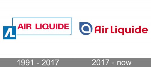
The company was established in 1902. During the last two decades of its history, the Air Liquide logo has preserved its main characteristics: the palette, the structure, and the name of the brand. Yet, it hasn’t stayed the same in every detail.
1991 — 2017
The oldest version on the list features two boxes: a smaller solid blue square and a large white rectangle with a thin blue border.
Inside the square, there is an emblem in white. You can describe it either as a stylized “AL” (the initials of the brand’s name) or part of the equipment used by Air Liquide in its work. The rectangle, in its turn, houses the full name of the company in a minimalist sans. The letters are red and form the most eye-catching part of the design.
2017 — Today
The emblem has grown cleaner and smoother. Many of the angles of the previous version were replaced by rounded elements, which also made the style friendlier.
Instead of the lettering “AL” there is a sign that the company describes as the “Alfa.” According to a post on the corporate website, the sign “stands for the beginning of a new phase” and “marks a new milestone in the Group’s history.”
The “Alfa” has a rather generic shape – it is basically a blue drop housing a white drop turned upside down. The drop shape seems meaningful as a sort of visual representation of the gases (that aren’t very easy to draw, anyway).
Font
Similar to the 1991 logo, the version introduced in 2017 features a sans serif typeface. The thickness of the strokes is pretty much the same. However, the type looks different. It is partly due to the fact that only the initials are uppercase. It has a more unique “A,” too, with the smoother, rounded top.
Colors
The Air Liquide logo combines a rather saturated shade of blue (as the symbol of the gas) with red (which makes the design more vivid and eye-catching). According to the press release, the type is a custom one. It was inspired by the shape of the “Alfa” sign.


