Everlast is an iconic American sport brand, famous for its boxing and mixed martial arts apparel. It was founded in 1910 by Jacob Golomb and today is a part of Sports Direct group, selling its collections in over 70 countries across the globe.
Meaning and history
The company started as a manufacturer of boxing equipment in 1910, has grown into the iconic sportswear brand by today, with its logo, instantly recognizable across the world, and is synonymous with stylish and high-quality apparel.
What is Everlast?
Everlast is the name of the world’s most famous box apparel brand, which was established in 191, and today not only produces clothing and accessories for sports but also presents a line of clothing in casual style, available for sale all over the globe.
1910 – 1978
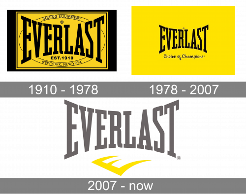
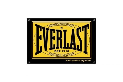
The original Everlast logo was composed of gold and black badge, resembling a buckle on the boxer’s belt. It was a yellow rectangle, placed on a bigger one, in black, with stylized rounded bolts in the corners. The yellow part featured a thin horizontal oval in a double black outline, with the “Boxing Equipment” written along its upper part, and “New York, New York” — at the bottom. The “Everlast” wordmark in all capitals was written in a black bold serif font, with its letters getting smaller to the center. Under the logotype, the “EST. 1910” datemark was placed, also in black.
1978 – 2007
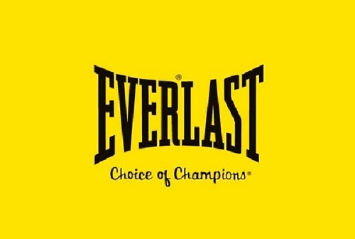
The redesign of 1978 simplified the iconic logo and kept only the wordmark, executed in the same style and typeface, with thick lines and massive square serifs. The black inscription was placed on a white background above an abstract emblem, drawn in black. The emblem featured a stylized letter “E”, which is diagonally oriented and has its horizontal bars alongside and sharpened, resembling claws and reflecting the label’s bangers is and powerful character. This version of the logo is still in use today.
2007 – Today
In 2007 the logo was redesigned again, but all changes were made only to its color palette. The original style and composition remained the same, while the logotype became light gray, and the emblem — yellow.
The new color scheme aimed to represent the brand’s progressiveness, energy, and reliability, along with the value of quality and their customer’s satisfaction.
Font and Color
The heavy uppercase lettering from the primary Everlast badge is set in a bold geometric serif font with narrowed characters. The closest fonts to the one, used in this insignia, are, probably, Grand Canyon RR Bold, or Winner Ultra Compressed Medium, with some minor modifications.
As for the color palette of the Everlast visual identity, it is based on a combination of gray and yellow, where gray is a symbol of strength and masculinity, and yellow stands for energy, motion, and joy.


