While Eurobank has a distinctive and bright logotype, it may seem somewhat cluttered.
Meaning and history
Eurobank is a shortened name of Eurobank Ergasias SA, the fourth largest bank in Greece. The financial organization was established in 1990, and by today has grown into a reputable and influential organization layer, which has its subsidiaries located in several European countries, including Luxembourg, Cyprus, Bulgaria, and the even United Kingdom.
Eurobank is headquartered in Athens, Greece has more than 600 branches across Europe, and a revenue of more than two billion euros. The bank is owned by Fairfax Financial Holdings.
1990 – 1998
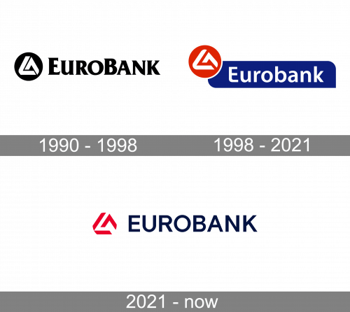
The original Eurobank logo was created for the company in 1990 and stayed untouched for more than eight years. It was a stable and elegant black-and-white badge, composed of bold serif lettering in the uppercase of a modern serif typeface, with the “E” and “B” enlarged, and a minimalistic emblem placed on the left. The emblem featured a solid black circle with a stylized white pyramid drawn on it.
1998 – 2021
The name of the brand was given in an unpretentious sans serif type. It looked rounded and friendly. The word consisted of only lowercase glyphs.
2021 – Today
The redesign of 2021 has fully modernized the Eurobank logo but kept all the main features, such as the red and blue color palette and the pyramidal emblem. The new uppercase lettering was set in dark blue and written in the clean and laconic sans-serif typeface against the white background, accompanied by a red stylized pyramid, drawn on the left of the wordmark, without any framing.
Current emblem
While the updated logo is pretty different from the original, you can still perceive a distinct link between them.
The type has grown slightly bolder, while the initial “E” has been capitalized. The red rectangle was replaced by a blue shape. It was still based on a rectangle but had two of its corners rounded.
The red color was still present but it now was used only for the symbol. The whirl turned into a stylized triangle with rounded corners, which was formed out of two abstract shapes.
Font
While the type used in the Eurobank logo may look pretty simple, it has a unique touch. For instance, note the bottom left angle of the “E” – its rounded shape echoes the elements forming the triangle above as well as the shape of many other glyphs, for instance, the “u” and the “a.”
Company overview
While Eurobank a.d. started working under a single brand and visual identity in 2006, its roots can be traced back to 2003.
The company is headquartered in Belgrade, Serbia and has 80 branches within the country. Its parent company is Greek Eurobank Ergasias.


