Etro is an Italian design studio that currently produces clothing for men and women, as well as fragrances. In addition, there are vast collections of bags, accessories, footwear and even furniture. Each group is filled with different categories and types of product. All these products follow similar design solutions that incorporate artistic patterns from India, among other things.
Meaning and History
The company was opened in 1968 by the Etro family, hence the name. Their iconic Indian patterns were only adopted in the 1980s. These are various flowery ornaments, which the company includes into many of their wares. The most prominent of them is a pattern of pear-like shapes, called paisley.
1968 – today
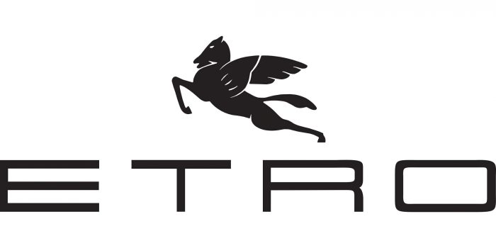
A Pegasus symbol has been the company’s primary emblem for a long time. It depicts a simplistic image of a horse with the wings on its back and a prostrated, leaping position. Some parts of it are morphed into unusual shapes. For instance, the legs are overly thin, and the head is a strange snake-like form. There aren’t too many details in this design – it’s mostly a silhouette of several separated components.
The name wordmark is another symbol used in the logo – sometimes in conjunction with the emblem, sometimes separately. It’s just the company’s name, written in four capital letters. The font uses wide, very linear and abrupt characters. Many line junctions are just straight corners, and the characters in general seem stretched sideways. The gaps between them can also vary from near enough to space enough to fit another letter of this sort.
The coloring for both the wordmark and the emblem is normally some shade of grey, white or black.


